
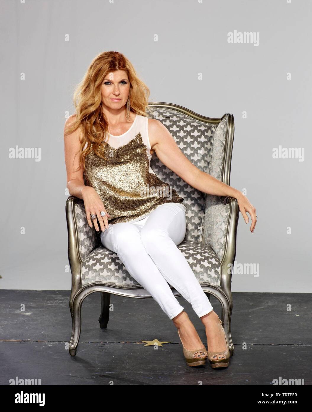
Connie Britton
is a Soft Autumn.
- Undertone
- Warm-neutral
- Contrast
- Low-medium
- Chroma
- Low (muted)
Connie Britton is a Soft Autumn. Muted, warm earth tones flatter her glowing coloring, while bright or stark shades overwhelm her gentle, low-contrast features.
Her main colors
Champagne
#E0D2B8
Sand
#C8B898
Khaki
#A89878
Mocha
#8B6B4F
Soft Camel
#B89A6E
Warm Taupe
#9E7E5C
Like honeyed linen.
This page is Connie's season. What's yours?
Fifteen quick picks — no photo, no email. You'll have your season by the end of this page.
Her coloring
Connie's undertone, skin tone & eye color.
The features that place Connie Britton in Soft Autumn: undertone, skin tone, eye color, hair, and natural contrast.
- Undertone
- Warm-neutral
- Skin tone
- Warm-neutral
- Eye color
- Hazel
- Hair
- Auburn brown
- Contrast
- Medium
About Connie Britton's colors
Why Connie is a Soft Autumn.
Britton reads warm-neutral and softly muted, the heart of Soft Autumn. Her honey-brown hair and warm skin carry a glow rather than a sharp contrast, so colors do best when they're dusted down. Champagne, sand, soft camel, warm taupe, sage, olive, dusty peach, and muted mauve flatter her gentle warmth without overpowering it.
She isn't a Soft Summer, that season runs cool and rosy, and ashy cool shades flatten her warm honey tones. She isn't a Warm Autumn either, since clear, saturated rusts and golds are too vivid for her soft contrast. The muted, low chroma is what makes her Soft Autumn.
Full Soft Autumnseason guide: traits, styling & celebrities →
Often confused with Soft Autumn vs Soft Summer and Soft Autumn vs Warm Autumn.
Signature palette
Best colors for Connie.
The twelve shades that harmonize with Connie Britton's soft autumn undertone, contrast, and depth.
Champagne
#E0D2B8
Sand
#C8B898
Khaki
#A89878
Mocha
#8B6B4F
Soft Camel
#B89A6E
Warm Taupe
#9E7E5C
Sage
#7A8470
Olive
#5C6E4A
Dusty Peach
#C49585
Soft Brick
#A06B6E
Muted Mauve
#8E6A8E
Soft Teal
#5A7882
Seen in her colors
Connie wears the palette.
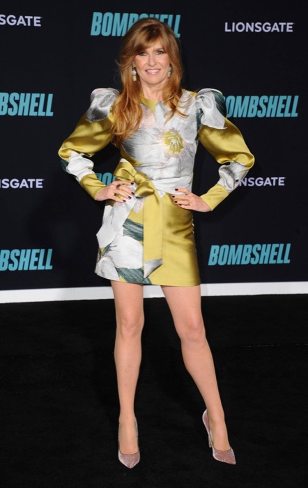
Connie Britton out in Soft Autumn shades, proof the palette already lives in her wardrobe.
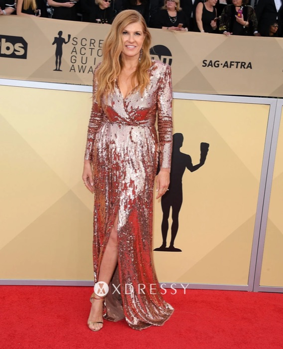
Soft Brick
#A06B6E
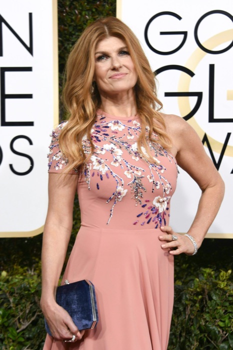
Soft Teal
#5A7882
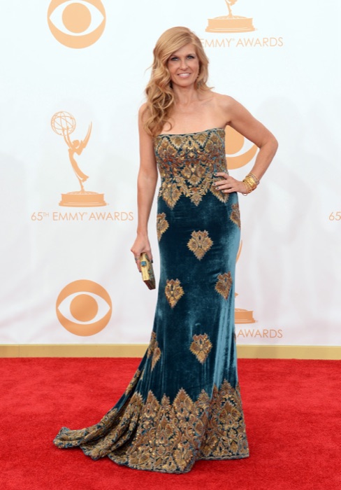
Champagne
#E0D2B8
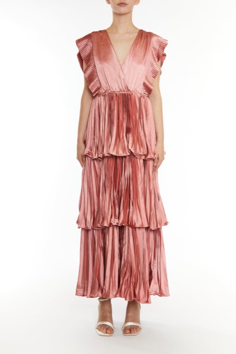
Dusty Peach
#C49585
You've seen Connie in her colors. Now find yours.
A free 15-pick quiz names your season and the shades that fight it. No photo needed.
The 12-season map
Where Connie sits.
Connie Britton's bubble sits in the Autumn quadrant, the family of colors that wear her best. The closer a color sits to her, the better it reads on her face.
What this means.
Stay in Autumn
Anything in the Autumn quadrant is on-team for Connie, even outside her sub-type.
Borrow neighbours
Soft Summer and Warm Autumn sit either side. Their picks cross over safely.
Skip the opposite
Soft Autumn sits opposite. Those shades drain Connie's face.
The read · Undertone
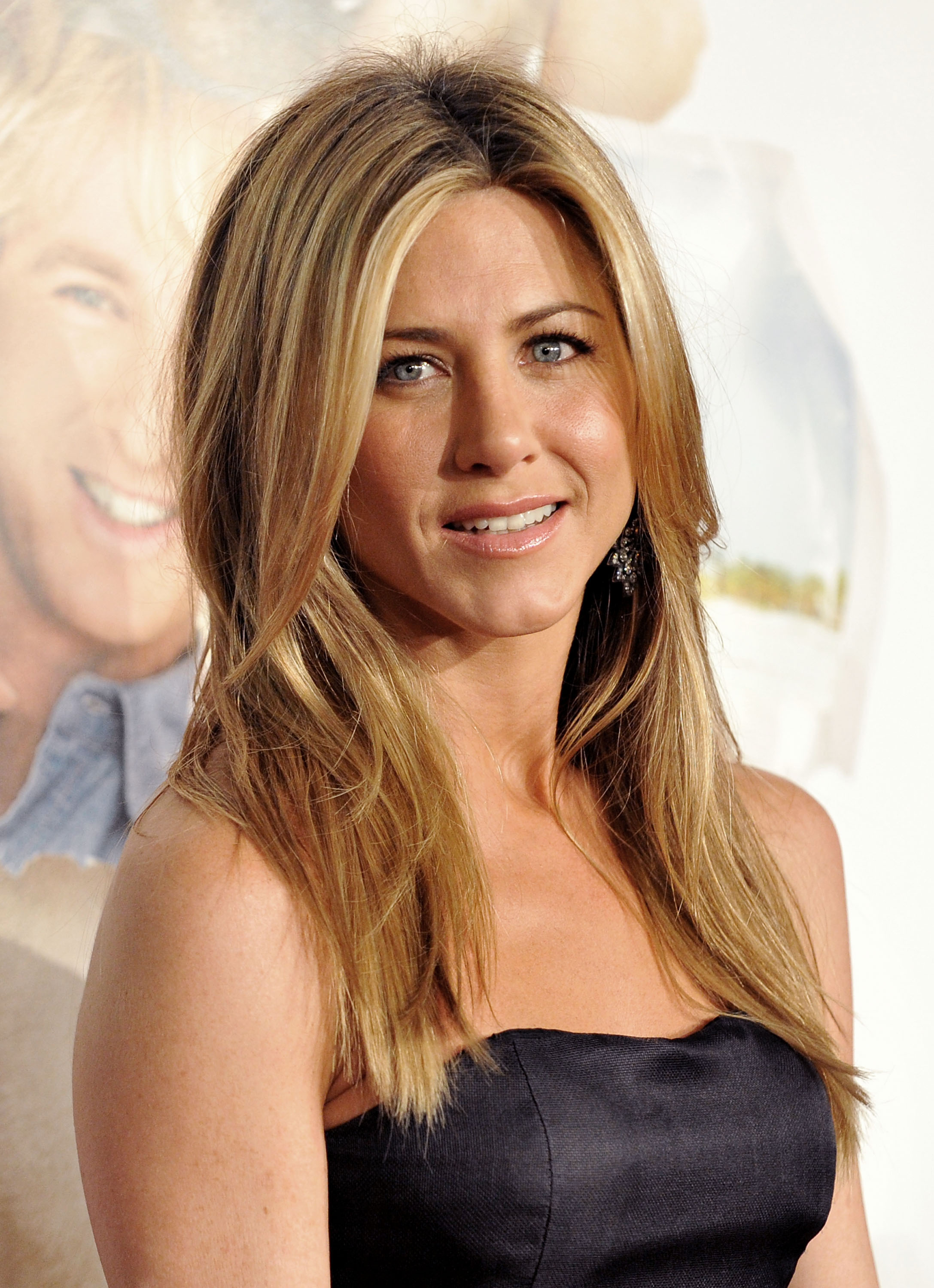
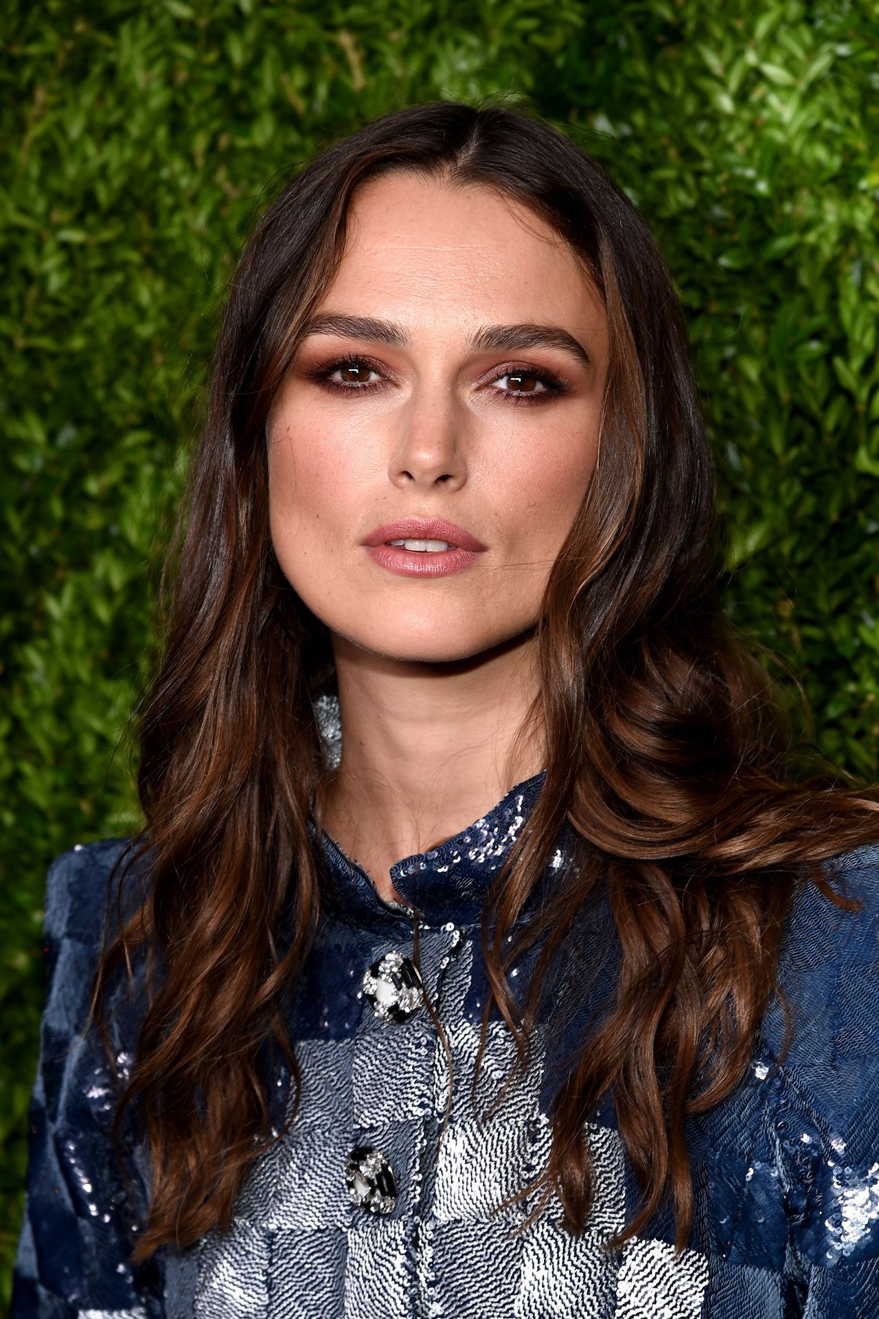
Her warm-neutral, peach-beige skin pairs with soft warm-grey-to-hazel eyes and famous honey-brown hair, all warm yet muted. Brushed gold, copper, and antique brass settle into her warmth, while bright silver and icy cool tones look cold and disconnected beside her soft, sunlit coloring.
Wear it well
- Wear champagne near the face
- Wear sand near the face
- Wear khaki near the face
- Wear mocha near the face
- Wear soft camel near the face
Skip on the rack
Colors Connie should skip.
These desaturate or age a Soft Autumn face.
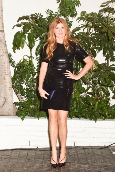
Pure Black
#000000
Too stark for your soft warmth
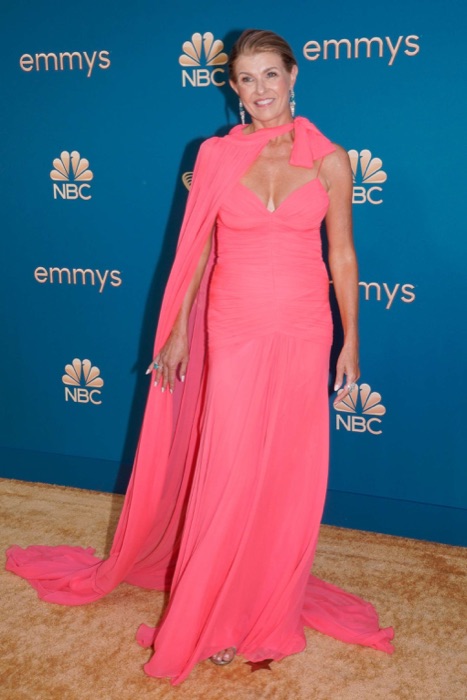
Optic White
#FFFFFF
Use cream or champagne instead
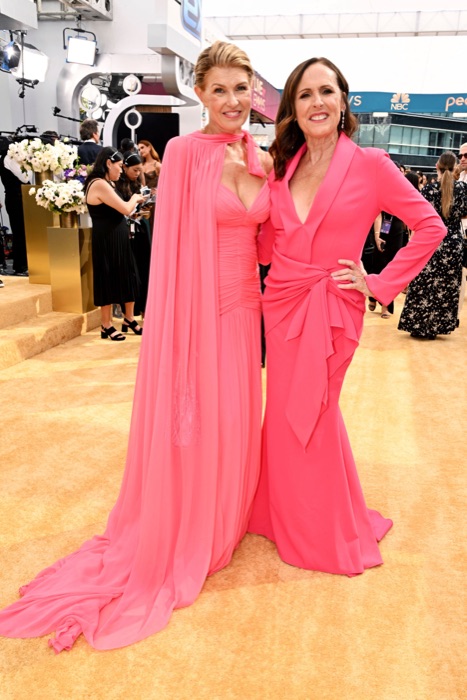
Hot Pink
#FF1493
Saturation level overwhelms you
Royal Blue
#0000FF
Too cool and bright
Makeup map
How Connie wears it.
Six product categories, five named picks each. Take these hexes to the counter, anything within a few shades wears like it was made for her.
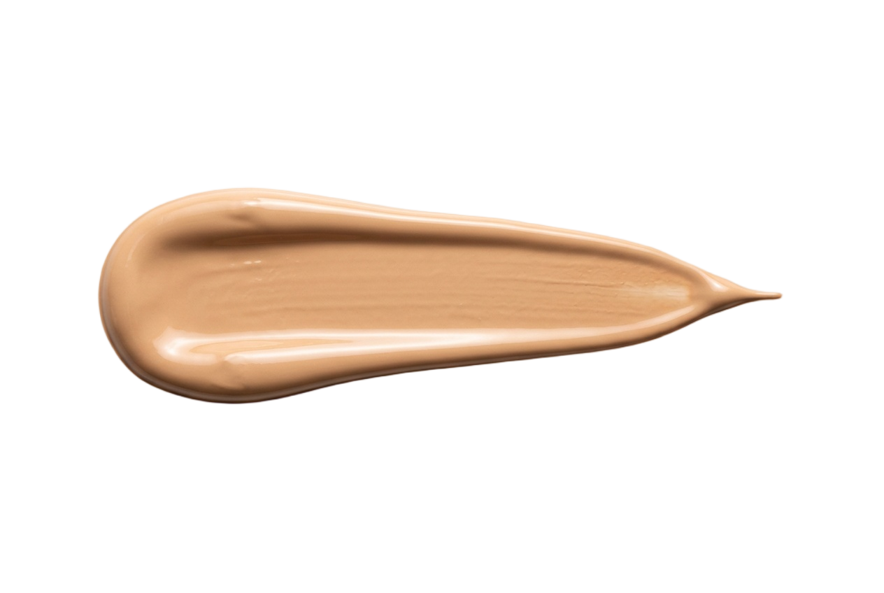
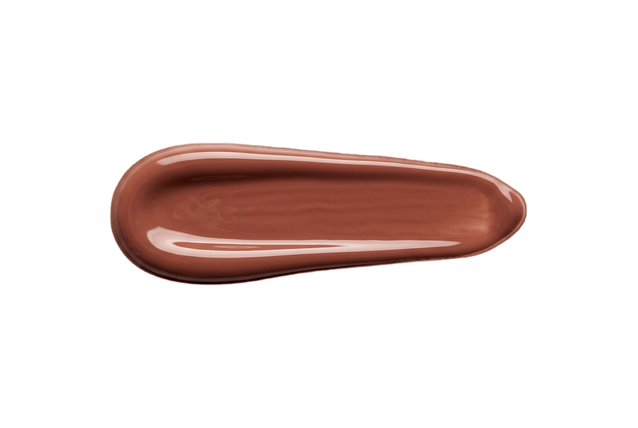
Foundation
Warm-neutral undertones, softly muted. Skip bright golden or stark pink bases, both read off on her.
Soft Ivory
#E6D2BC
Warm Beige
#D8BE9E
Neutral Sand
#CBAE8E
Soft Tan
#BC9C7A
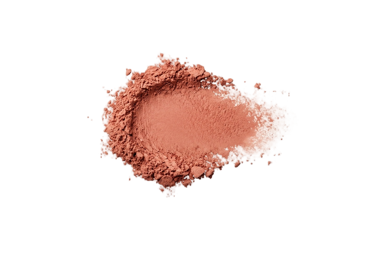
Blush
Soft peach, warm rose, and dusty apricot. Bright cool pinks overpower her softness.
Dusty Peach
#DBA88A
Warm Rose
#C99184
Soft Apricot
#D9A582
Muted Terracotta
#BE846A
Eyeshadow
Soft gold, warm taupe, muted olive, and camel. Avoid icy brights and stark jewel tones.
Soft Gold
#C9AE7E
Warm Taupe
#A88E72
Camel
#B08F63
Muted Olive
#726A46
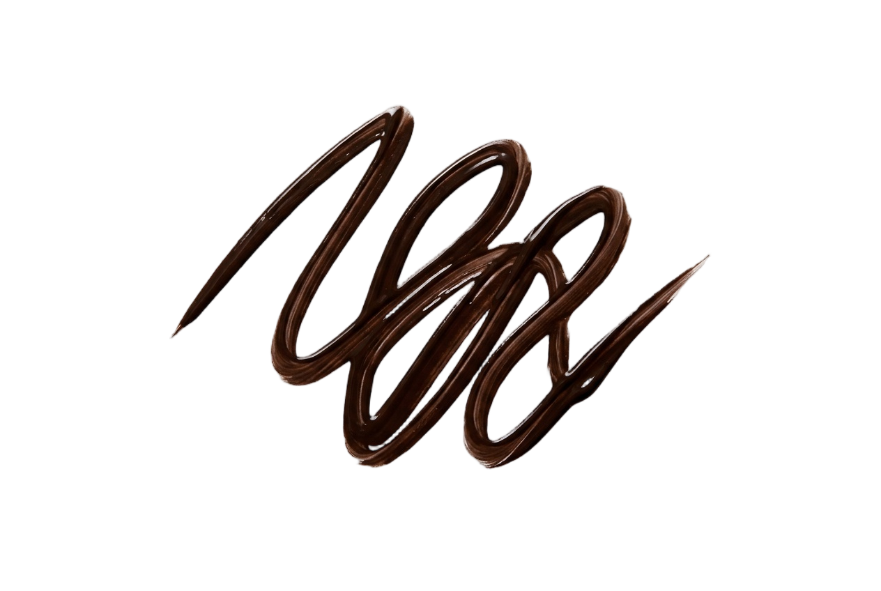
Eyeliner
Soft brown, warm olive, and bronze. Jet black is too harsh for her low contrast.
Soft Brown
#5E4838
Warm Taupe
#786552
Olive
#5E5838
Bronze
#7A5A38
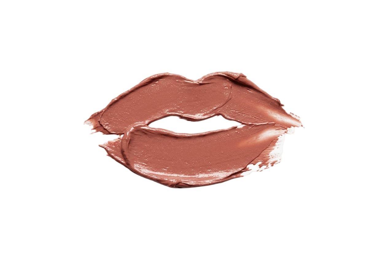
Lip Colors
Soft terracotta, dusty rose, and warm nude. Skip bright blue-reds and cool fuchsias.
Warm Nude
#C39079
Dusty Rose
#B57E77
Soft Terracotta
#B36F58
Muted Brick
#A56052
Nail Polish
Soft caramel, dusty rose, and warm taupe. Skip icy pastels and bright cool pinks.
Soft Caramel
#B99070
Dusty Rose
#B57E77
Warm Taupe
#9C8068
Muted Mauve
#96706E
Your face has a palette like this one.
Find out which of the twelve is yours — free, fifteen picks, nothing to upload.
More Soft Autumns
Same season, same palette.
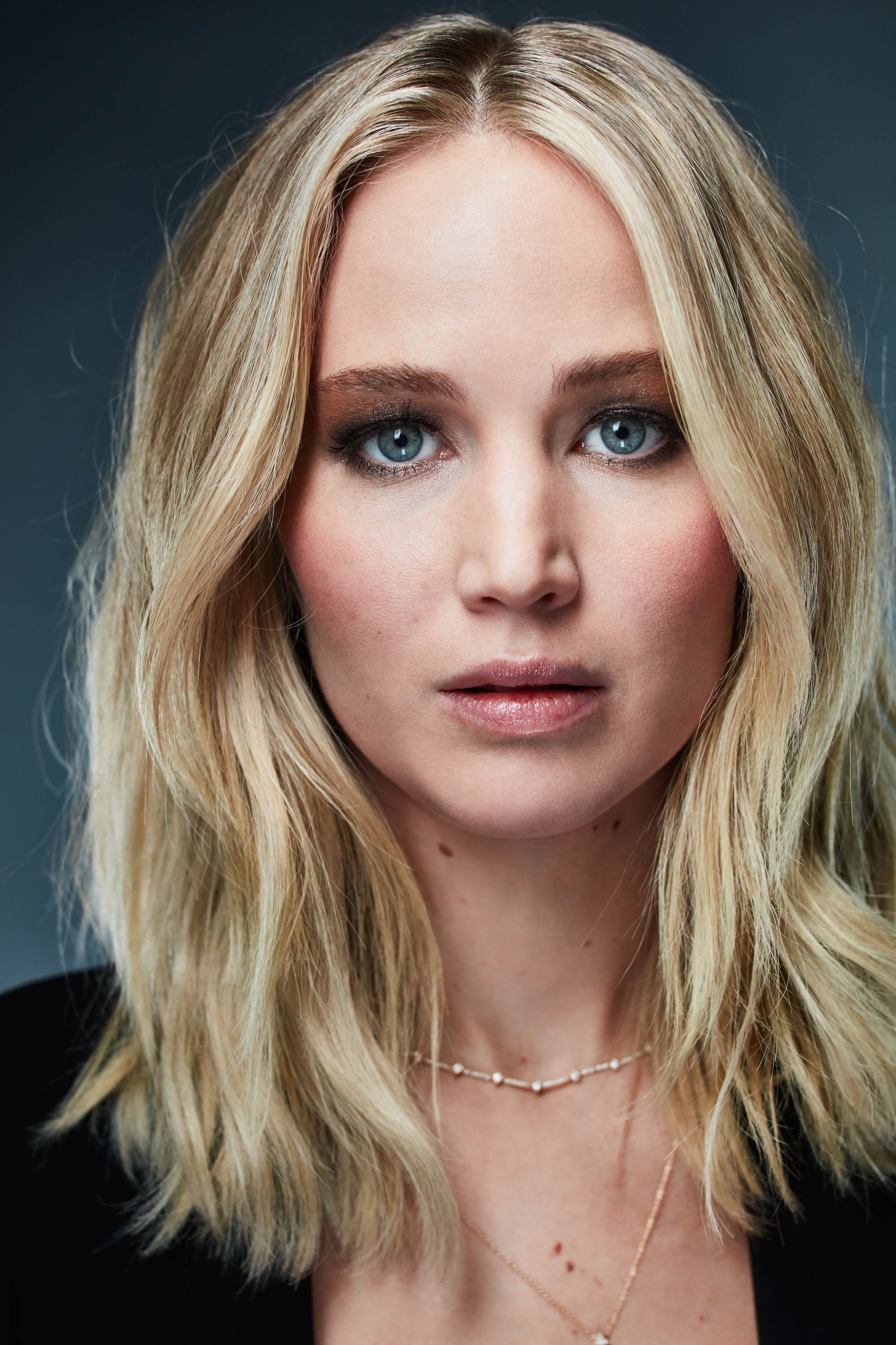
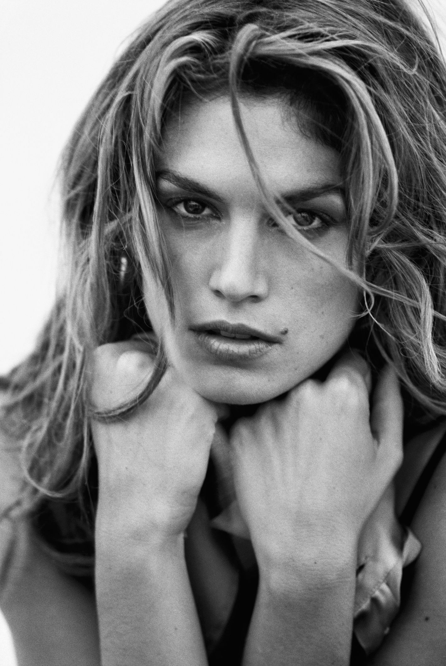
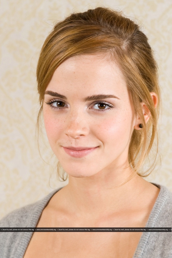
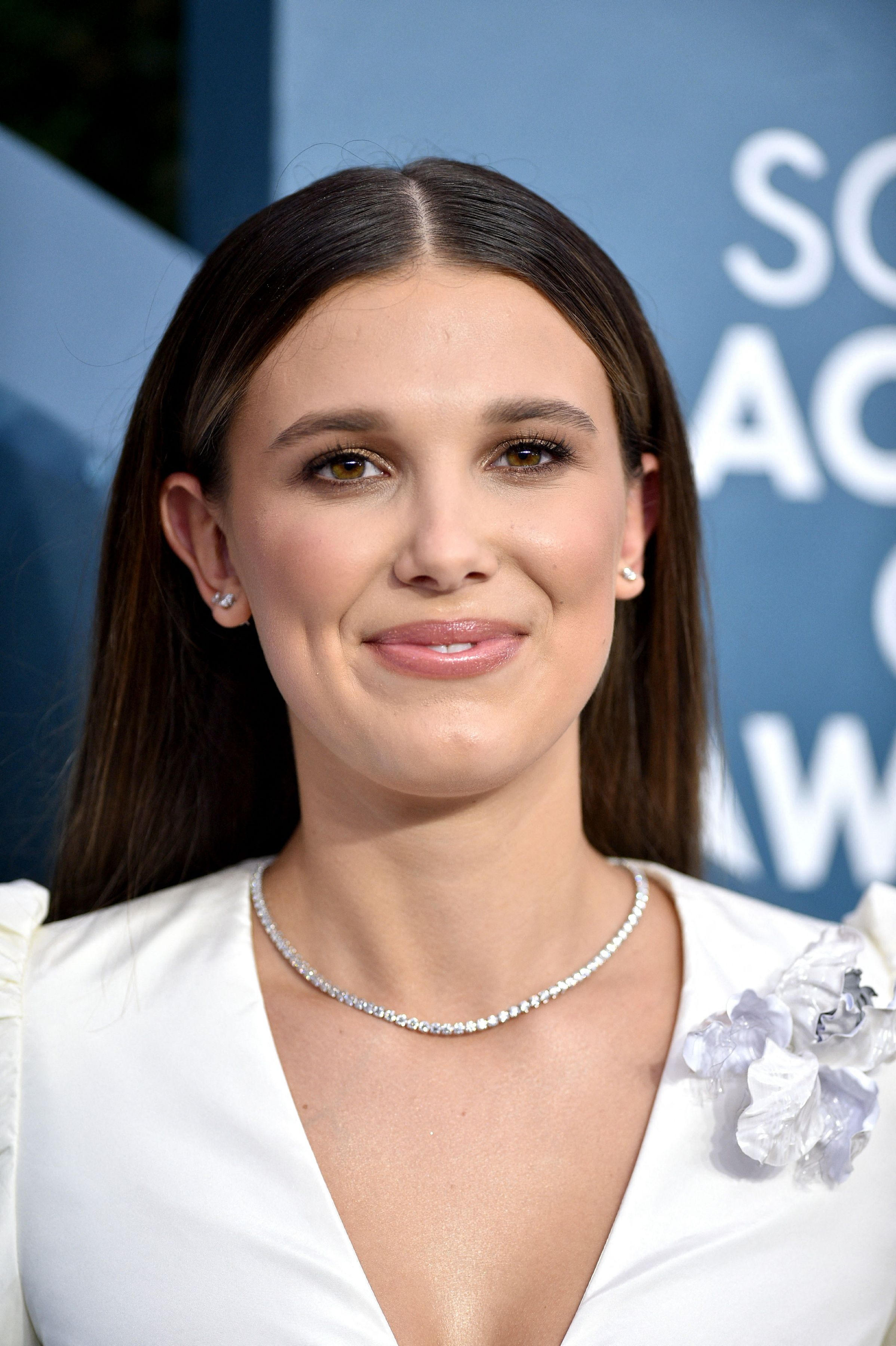
Other celebrities who share Connie Britton's Soft Autumn coloring, plus the full season guide.
Connie Britton · color questions
Connie's color questions.
What color season is Connie Britton?+
Connie Britton is a Soft Autumn. Her warm-neutral peach-beige skin, soft warm-grey-hazel eyes, and signature honey-brown hair create gentle warmth and low contrast, so muted earth tones flatter her while bright, clear, or stark colors overwhelm her glow.
What are Connie Britton's best colors to wear?+
Champagne, sand, soft camel, warm taupe, mocha, sage, olive, dusty peach, muted mauve, and soft teal suit her honey coloring. For neutrals, cream and warm taupe beat black and optic white, and brushed gold or copper jewelry flatters her more than silver.
Is Connie Britton a Soft Autumn or a Warm Autumn?+
Soft Autumn. Both seasons are warm, but Warm Autumn wears clear, saturated color while Britton's coloring is gently muted and low-contrast. The soft, dialed-down chroma of her honey-brown coloring places her in Soft Autumn rather than the bolder Warm Autumn.
What colors should Connie Britton avoid?+
Pure black and optic white are too harsh, swap in mocha and champagne. Hot pink and royal blue overwhelm with saturation, and bright gold reads brassy. She's best in muted gold, soft teal, and dusty peach, where color supports rather than overpowers her warmth.
What lipstick suits Connie Britton's coloring?+
Warm rose, dusty terracotta, soft brick, and muted apricot complement her honey-toned skin best. She should skip cool blue-reds and bright fuchsias, which clash with her warmth, in favor of soft, earthy shades that mirror her muted natural palette.
Which season are you?
Connie Britton is a Soft Autumn. Fifteen picks and you'll know yours — free, no photo.