Emily Ratajkowski
is a Deep Autumn.
- Undertone
- Warm
- Contrast
- High
- Chroma
- Medium-high
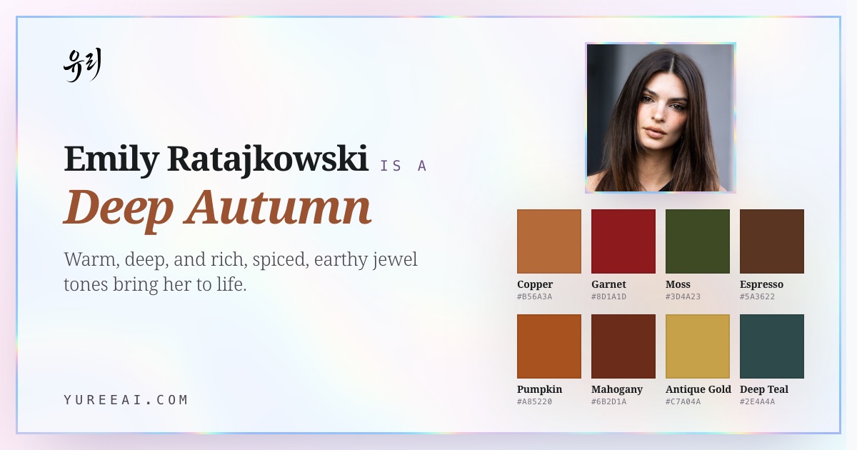
Emily Ratajkowski is a Deep Autumn, her coloring pairs the depth of Winter with the warmth of Autumn, so the richest, most heated earth tones read as effortless on her.
Her main colors
Copper
#B56A3A
Garnet
#8D1A1D
Moss
#3D4A23
Espresso
#5A3622
Pumpkin
#A85220
Mahogany
#6B2D1A
Like sun-warmed amber, ink on parchment, and polished bronze.
This page is Emily's season. What's yours?
Fifteen quick picks — no photo, no email. You'll have your season by the end of this page.
Her coloring
Emily's undertone, skin tone & eye color.
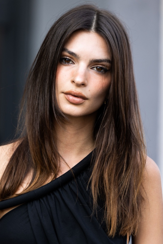
The features that place Emily Ratajkowski in Deep Autumn: undertone, skin tone, eye color, hair, and natural contrast.
- Undertone
- warm olive
- Skin tone
- warm olive-tan
- Eye color
- deep brown
- Hair
- dark espresso brown
- Contrast
- high
About Emily Ratajkowski's colors
Why Emily is a Deep Autumn.
Dark espresso hair, warm olive-tan skin, and deep brown eyes give her both high depth and clear warmth. Molten, saturated shades, burnt orange, garnet, forest teal, antique gold, echo that intensity and let her features stay the focal point instead of the fabric.
She reads Deep rather than Warm Autumn: her contrast level is higher and she carries near-black shades beautifully, which a lighter, softer Warm Autumn cannot. And she's Autumn rather than Deep Winter because her base is unmistakably warm, pure black-and-white Winter palettes drain her, where a Deep Winter would come alive in them.
Full Deep Autumnseason guide: traits, styling & celebrities →
Often confused with Deep Autumn vs Deep Winter and Deep Autumn vs Warm Autumn.
Signature palette
Best colors for Emily.
The twelve shades that harmonize with Emily Ratajkowski's deep autumn undertone, contrast, and depth.
Copper
#B56A3A
Garnet
#8D1A1D
Moss
#3D4A23
Espresso
#5A3622
Pumpkin
#A85220
Mahogany
#6B2D1A
Antique Gold
#C7A04A
Deep Teal
#2E4A4A
Wine
#7A2D2A
Burnt Orange
#C46322
Soft Black-Brown
#1F1815
Warm Ivory
#F4DCB0
Seen in her colors
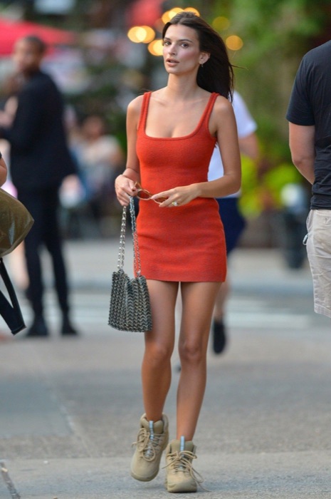
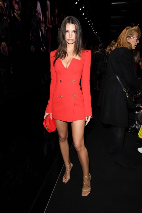
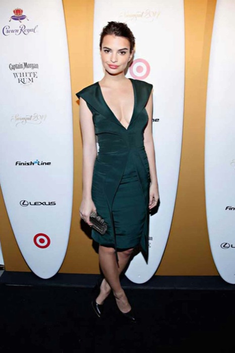
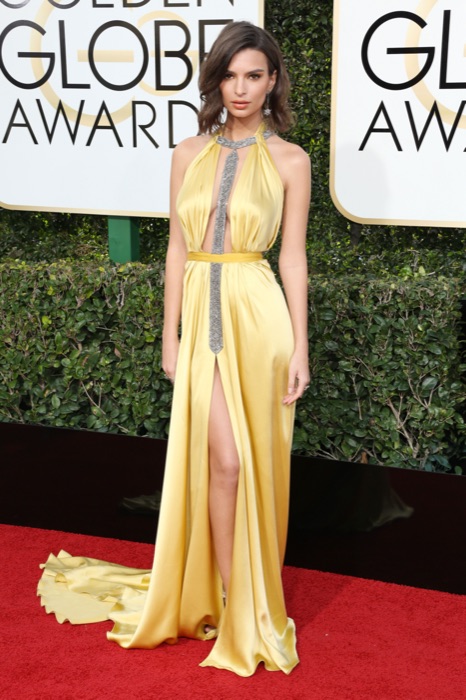
Emily wears the palette.
Emily Ratajkowski out in Deep Autumn shades, proof the palette already lives in her wardrobe.
Burnt Orange
#C46322
Garnet
#8D1A1D
Deep Teal
#2E4A4A
Antique Gold
#C7A04A
You've seen Emily in her colors. Now find yours.
A free 15-pick quiz names your season and the shades that fight it. No photo needed.
The 12-season map
Where Emily sits.
Emily Ratajkowski's bubble sits in the Autumn quadrant, the family of colors that wear her best. The closer a color sits to her, the better it reads on her face.
What this means.
Stay in Autumn
Anything in the Autumn quadrant is on-team for Emily, even outside her sub-type.
Borrow neighbours
Deep Winter and Warm Autumn sit either side. Their picks cross over safely.
Skip the opposite
Deep Autumn sits opposite. Those shades drain Emily's face.
The read · Undertone
Warm with an olive cast. Her skin holds golden-bronze pigment that turns luminous next to spice and rust and looks sallow beside anything icy or ashen.
Wear it well
- Wear copper near the face
- Wear garnet near the face
- Wear moss near the face
- Wear espresso near the face
- Wear pumpkin near the face
Skip on the rack
Colors Emily should skip.
These desaturate or age a Deep Autumn face.
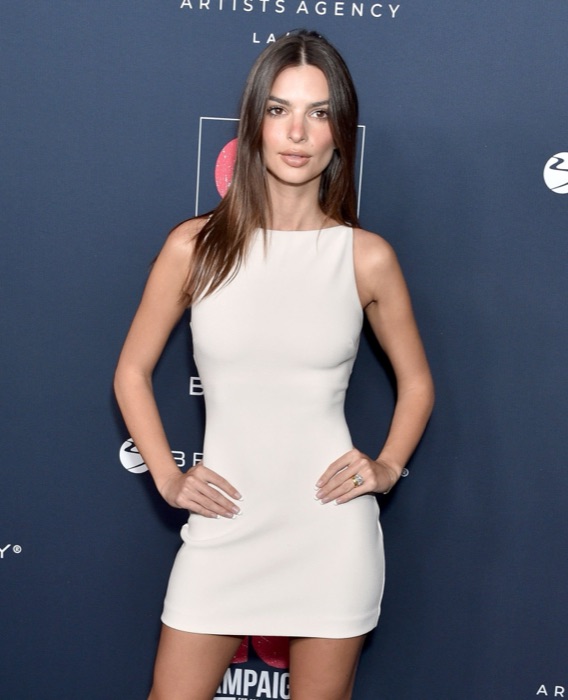
Optic White
#FFFFFF
Drains your richness, use ivory
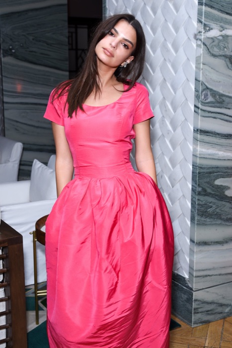
Pastel Pink
#FFC0CB
Too light and cool
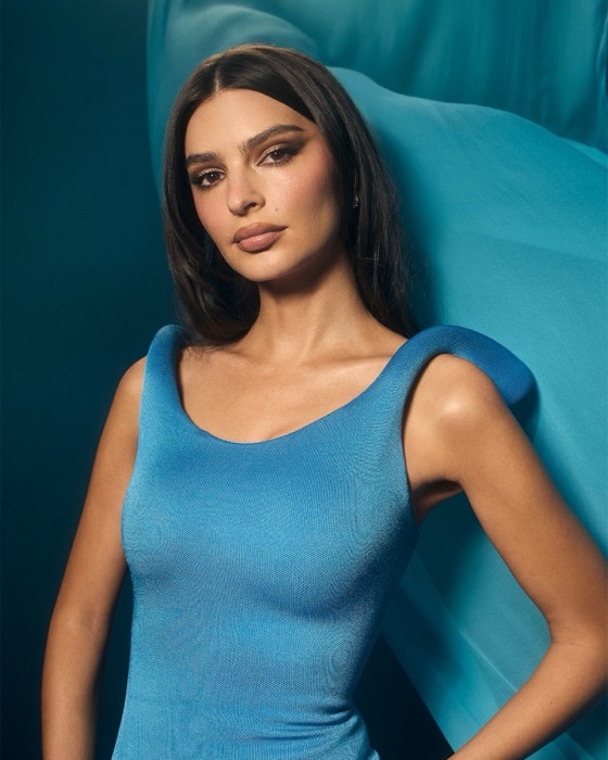
Baby Blue
#A8C8D8
Cool pastel fights your depth
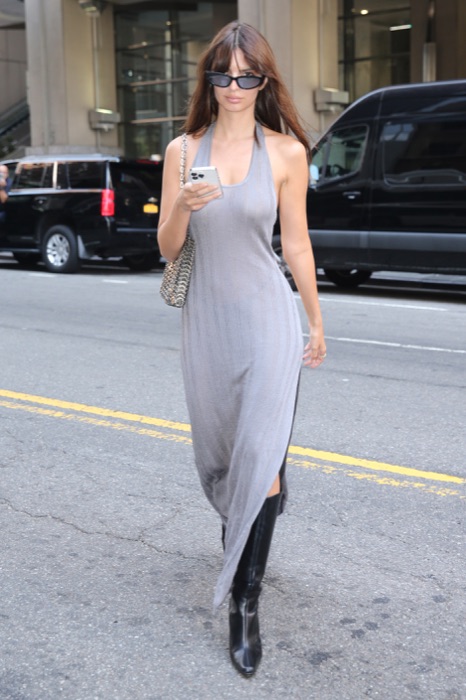
Pure Grey
#888888
Too neutral and dull
Makeup map
How Emily wears it.
Six product categories, five named picks each. Take these hexes to the counter, anything within a few shades wears like it was made for her.
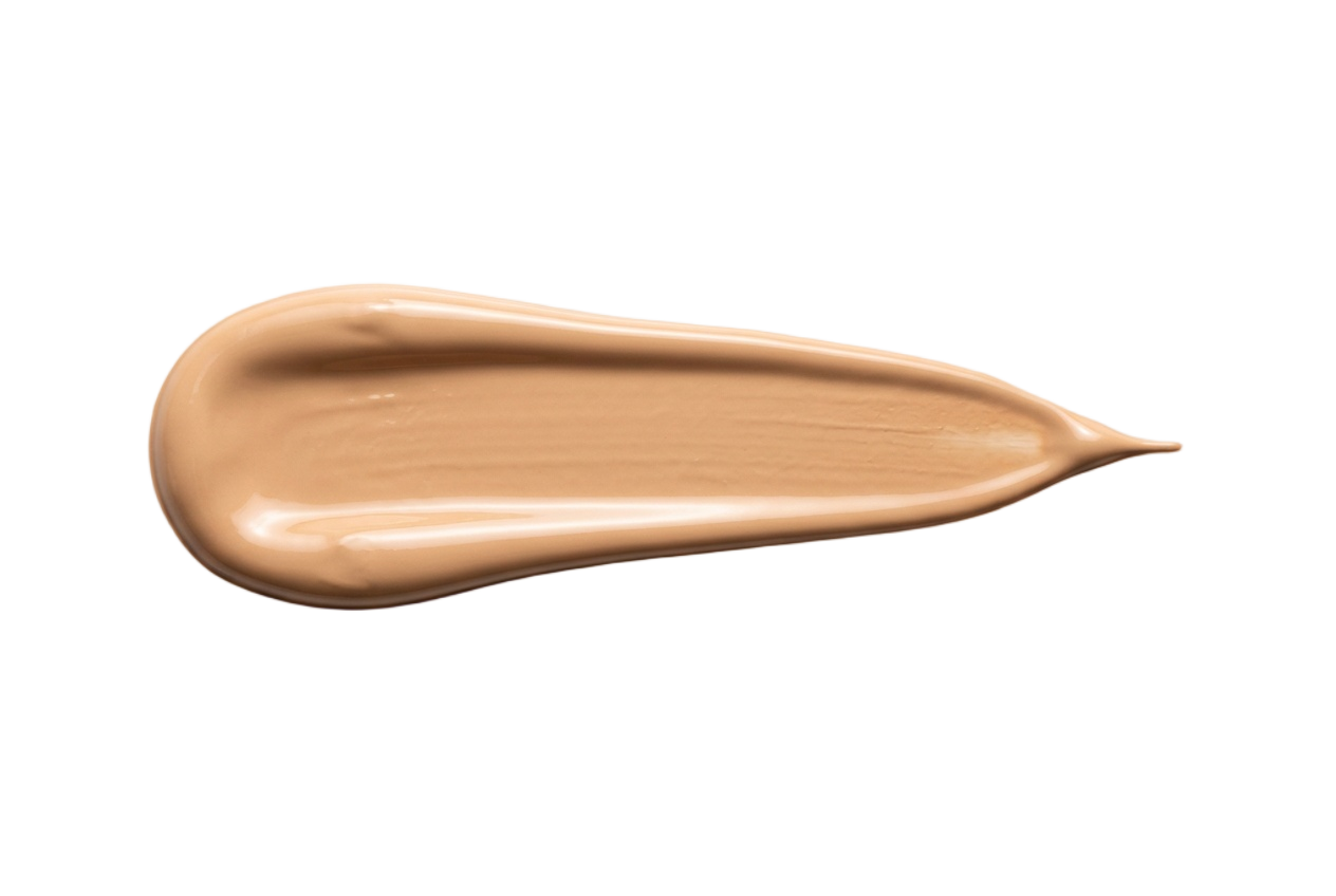
Foundation
Warm, golden, peachy undertones. Skip pink or cool olive bases, they read tired on her.
Warm Beige
#D6B391
Honey Sand
#C9A47A
Peachy Buff
#DBB39A
Caramel Beige
#C09775
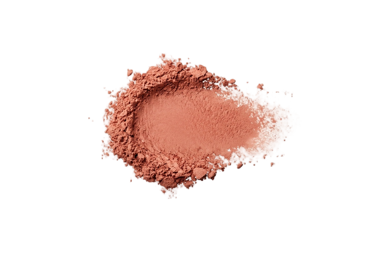
Blush
Peach, apricot, warm rose, and terracotta. Cool berry tones fight her warmth.
Apricot
#DCAC8B
Peach
#E0A07F
Warm Rose
#C68C7E
Terracotta
#C28A55
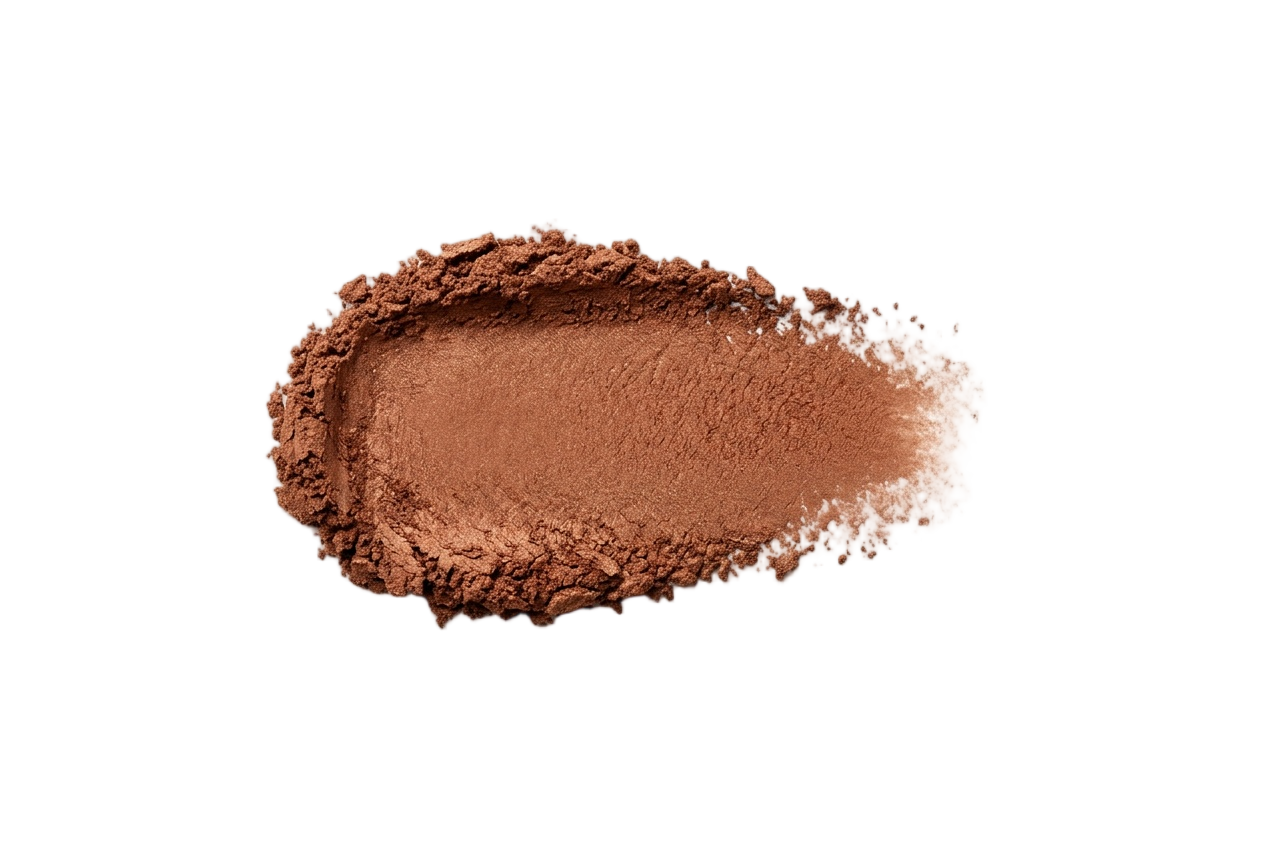
Eyeshadow
Gold, copper, bronze, olive, and warm brown. Avoid icy silvers and cool jewel tones.
Bone
#E8DCC8
Camel
#A78B6A
Bronze
#B6803D
Olive
#6E5C3B
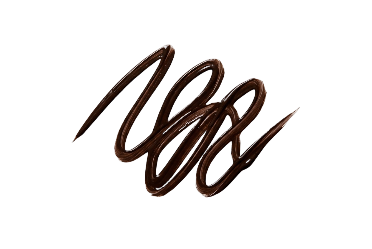
Eyeliner
Brown, olive, and bronze. Pitch black reads harsh, her lash line wants softer depth.
Espresso
#3D2817
Walnut
#5C4838
Olive
#5E5A36
Bronze
#7A5530
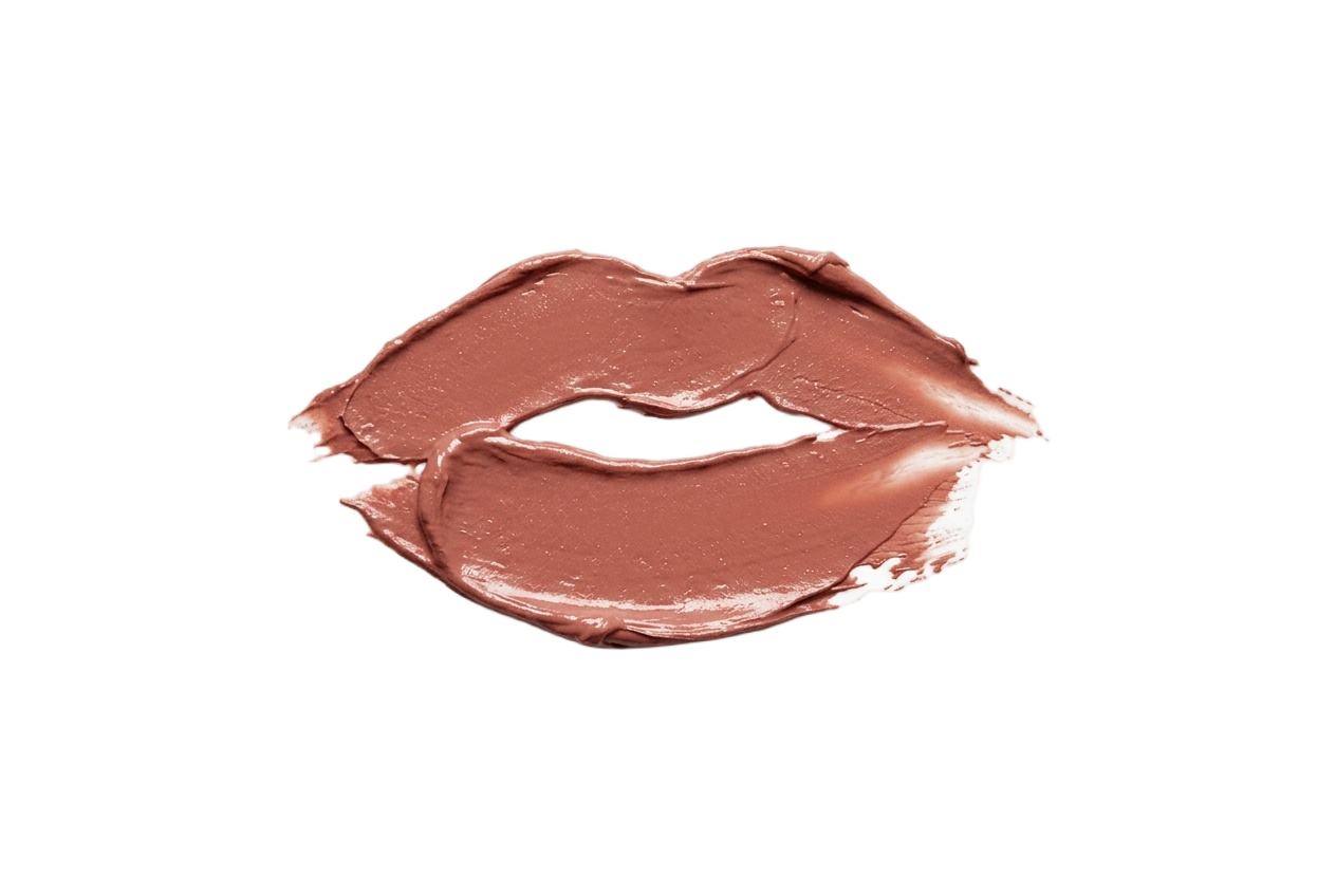
Lip Colors
Caramel nude, dusty rose, brick, and mulled wine. Skip cool fuchsias and bright blue-reds.
Peachy Nude
#C9947B
Caramel Nude
#A6745F
Dusty Rose
#B87B7B
Brick
#A85A48
Nail Polish
Warm caramels, almonds, and wines. Skip frosty pinks and icy blue-toned pastels.
Toasted Almond
#C9A689
Caramel
#A07F58
Deep Mauve
#8B6065
Espresso
#5C4032
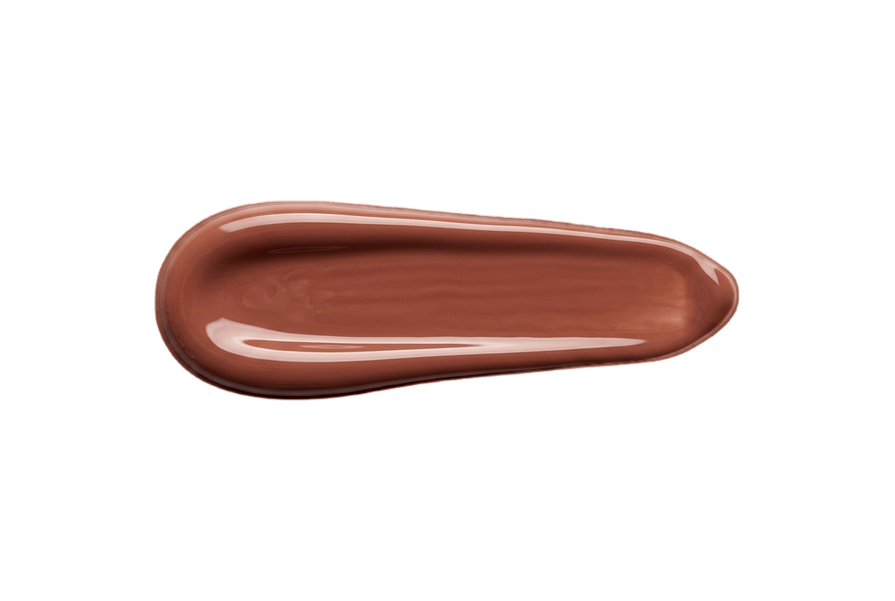
Your face has a palette like this one.
Find out which of the twelve is yours — free, fifteen picks, nothing to upload.
More Deep Autumns
Same season, same palette.
Other celebrities who share Emily Ratajkowski's Deep Autumn coloring, plus the full season guide.
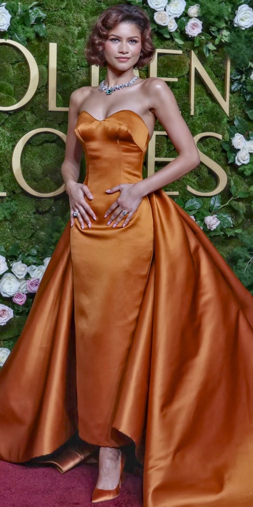
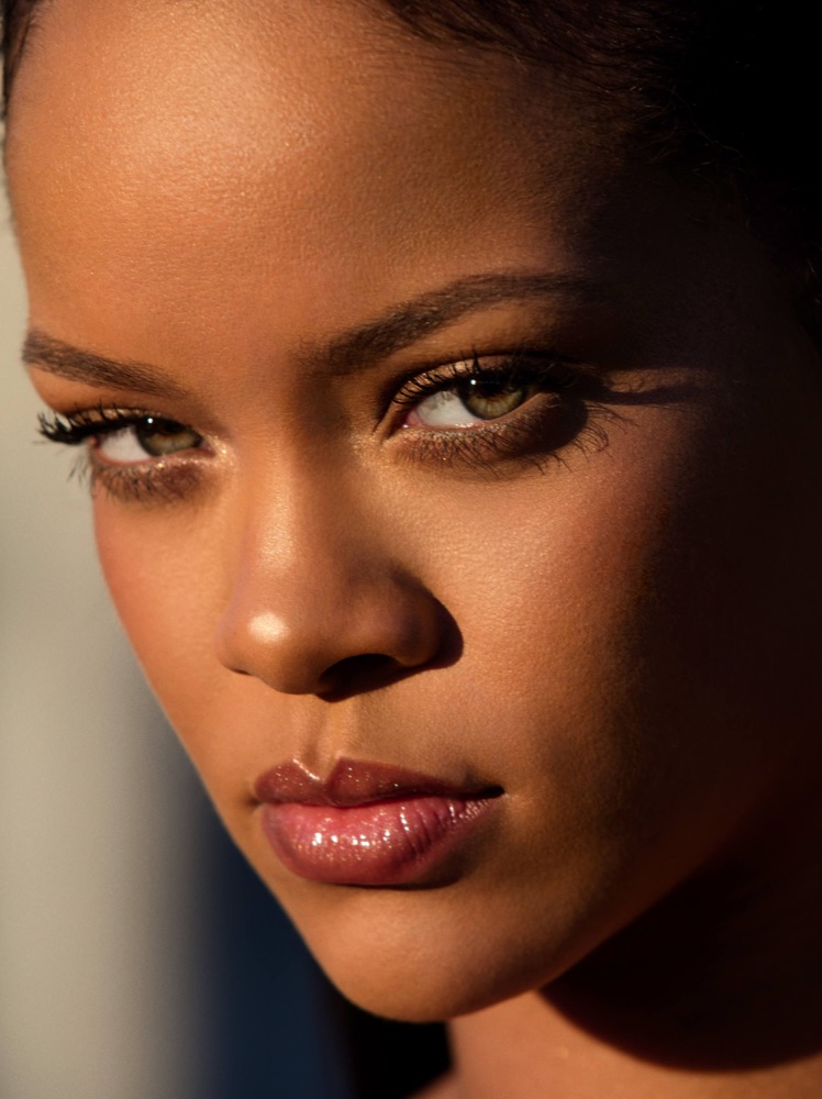
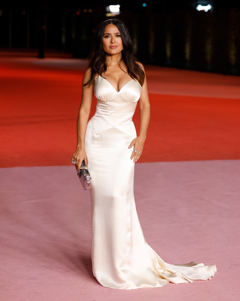
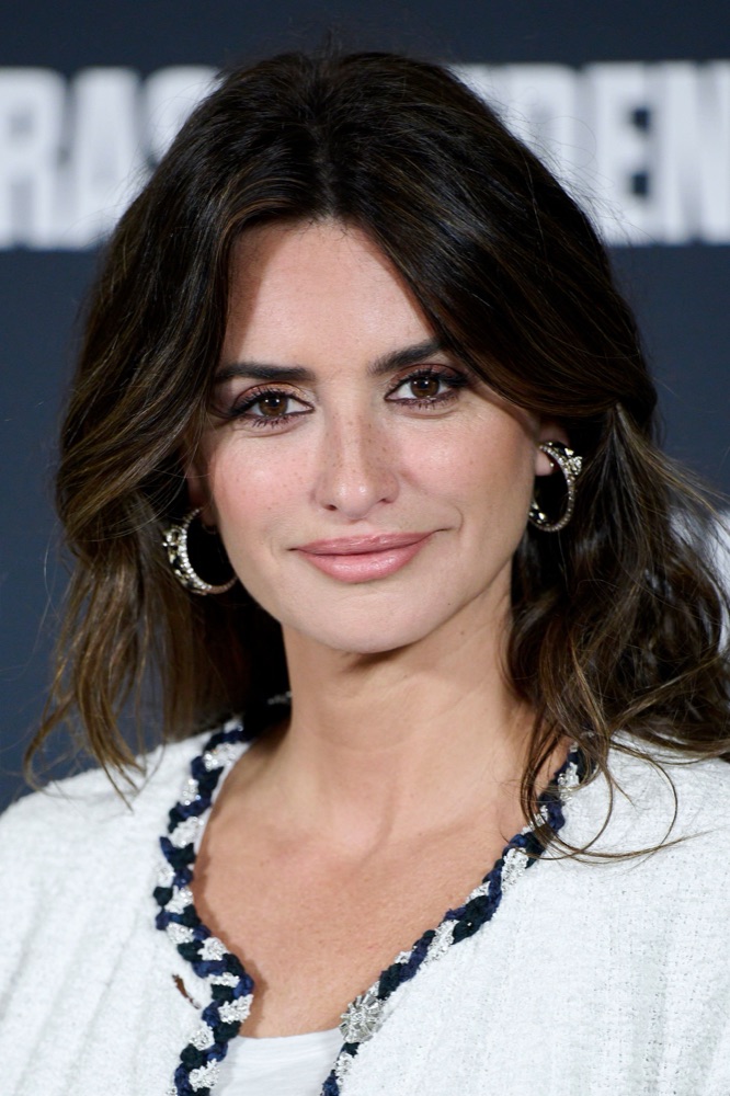
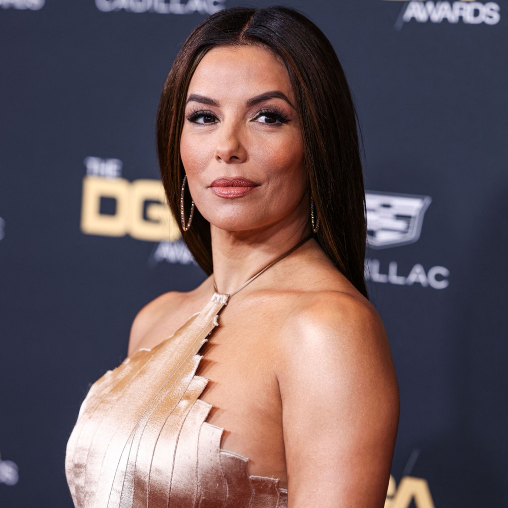
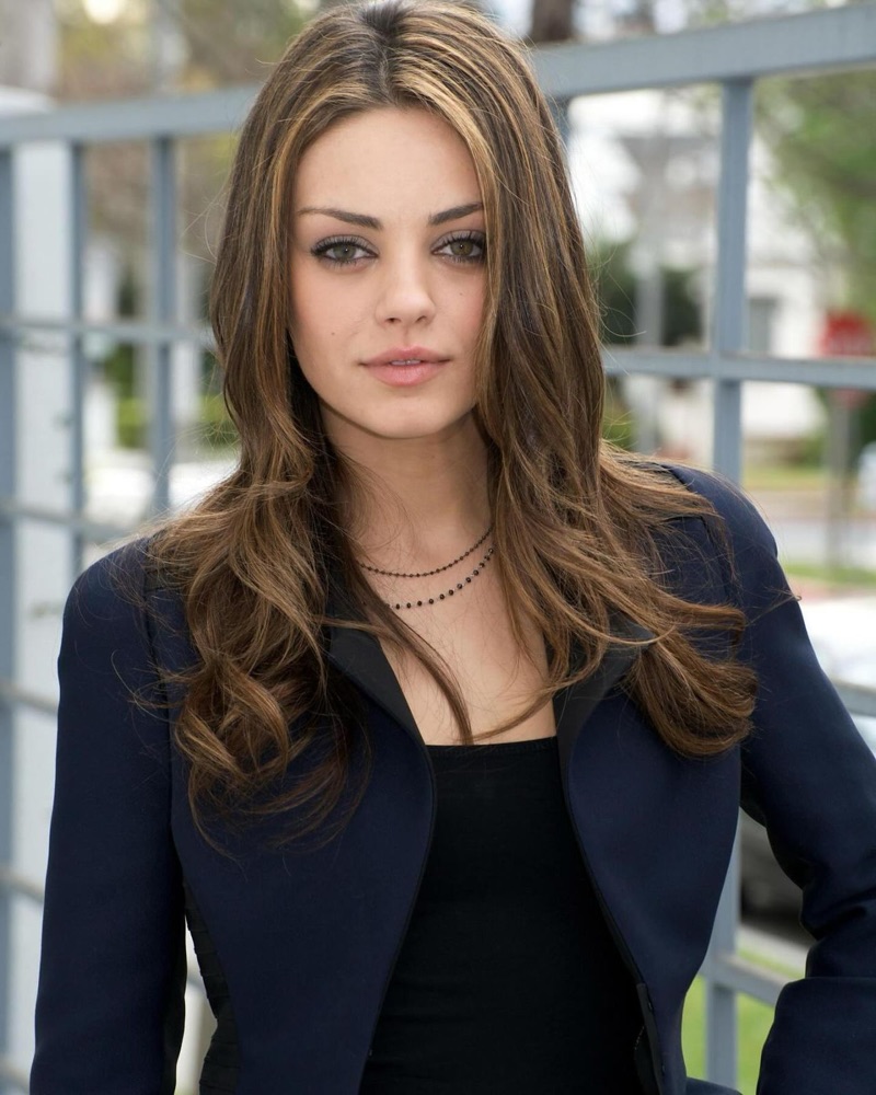
Olive skin
Emily has olive skin.
The foundation, makeup, hair and clothing colors for warm, cool and soft olive, from analyses like this one.
Emily Ratajkowski · color questions
Emily's color questions.
What color season is Emily Ratajkowski?+
Emily Ratajkowski is a Deep Autumn. She combines the darkness and depth of Winter with the golden warmth of Autumn, so heated, saturated earth tones flatter her most.
What colors look best on Emily Ratajkowski?+
Rich, warm, deep shades: burnt orange, garnet and brick red, forest and teal green, antique gold, chocolate brown, and deep olive. These match her depth without competing with her features.
Is Emily Ratajkowski a Warm Autumn?+
No. She shares Autumn's warmth, but her contrast runs higher and she wears near-black tones easily, which places her in the deeper, more dramatic Deep Autumn rather than the lighter Warm Autumn.
What colors should Emily Ratajkowski avoid?+
Cool, pale, and washed-out shades: optic white, pastel pink, baby blue, and pure grey. They fight her warm olive undertone and mute the natural glow in her skin.
What lipstick suits Emily Ratajkowski?+
Warm, deepened reds and browns, brick red, terracotta, spiced russet, and warm cinnamon-nude. She should skip cool blue-reds and frosty pinks, which clash with her golden undertone.
Which season are you?
Emily Ratajkowski is a Deep Autumn. Fifteen picks and you'll know yours — free, no photo.
Share
Emily Ratajkowski's palette card