
Kate Hudson
is a Light Spring.
- Undertone
- Warm-neutral
- Contrast
- Low
- Chroma
- Medium-low
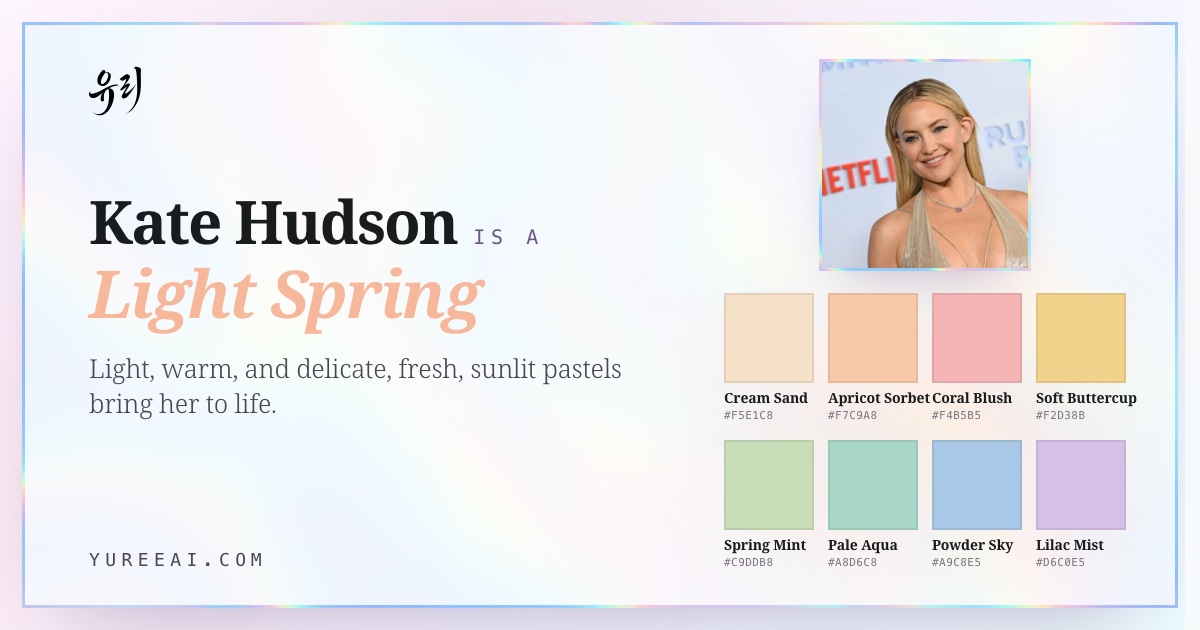
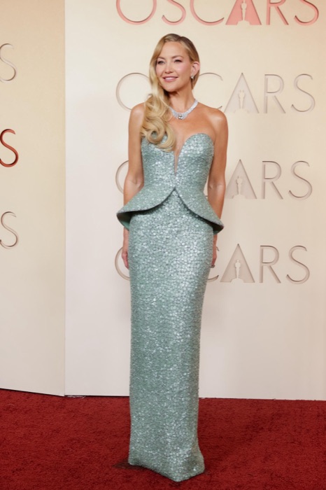
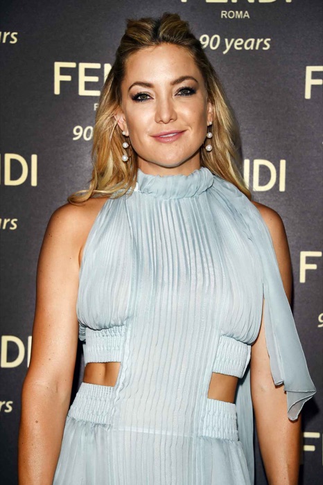
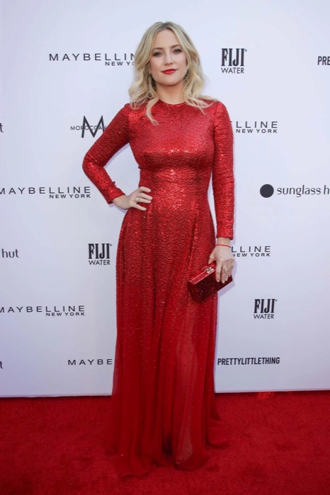
Kate Hudson is a Light Spring. Her fair, warm-toned skin carries a golden glow, and with sunny blonde hair and a light, soft contrast, clear warm tones, apricot, coral, sage green, and powder blue, light her up, while stark or heavy shades drain her.
Her main colors
Cream Sand
#F5E1C8
Apricot Sorbet
#F7C9A8
Coral Blush
#F4B5B5
Soft Buttercup
#F2D38B
Spring Mint
#C9DDB8
Pale Aqua
#A8D6C8
Like honeyed linen, morning fog, and aged rose.
This page is Kate's season. What's yours?
Fifteen quick picks — no photo, no email. You'll have your season by the end of this page.
Her coloring
Kate's undertone, skin tone & eye color.
The features that place Kate Hudson in Light Spring: undertone, skin tone, eye color, hair, and natural contrast.
- Undertone
- Warm
- Skin tone
- Fair, golden glow
- Eye color
- Warm hazel
- Hair
- Golden blonde
- Contrast
- Low
About Kate Hudson's colors
Why Kate is a Light Spring.
Light Spring is light, warm, and clear, and Kate sits right in it. Her skin reads warm rather than cool, her hair holds a sunny golden cast, and the overall value stays light with gentle contrast. That calls for warm tints with a little clarity, apricot, coral, peach, sage green, light aqua, colors that echo her own glow instead of flattening it.
She's often typed as a Warm Spring because of how well she wears gold, but the most saturated warm brights sit a touch heavy on her lighter, softer coloring. Against Light Summer she's warmer, not cooler, cool pastels leave her slightly washed, while the same lightness on the warm side puts the glow back in her cheeks. Warmth and lightness together are the deciding signal: Light Spring, not Warm Spring or Light Summer.
Full Light Springseason guide: traits, styling & celebrities →
Often confused with Light Spring vs Light Summer and Light Spring vs Warm Spring.
Signature palette
Best colors for Kate.
The twelve shades that harmonize with Kate Hudson's light spring undertone, contrast, and depth.
Cream Sand
#F5E1C8
Apricot Sorbet
#F7C9A8
Coral Blush
#F4B5B5
Soft Buttercup
#F2D38B
Spring Mint
#C9DDB8
Pale Aqua
#A8D6C8
Powder Sky
#A9C8E5
Lilac Mist
#D6C0E5
Petal Pink
#E8A8B8
Caramel
#C68B5C
Light Jade
#7AB59D
Champagne Ivory
#E0E5D5
See the full Light Springpalette, hex codes & anti-palette →
Seen in her colors
Kate wears the palette.
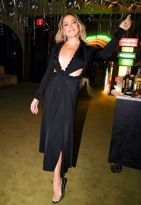
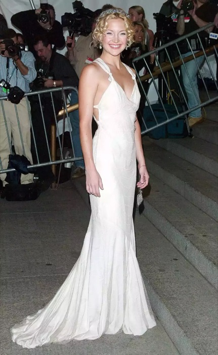
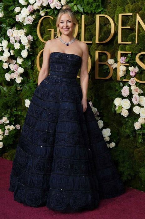
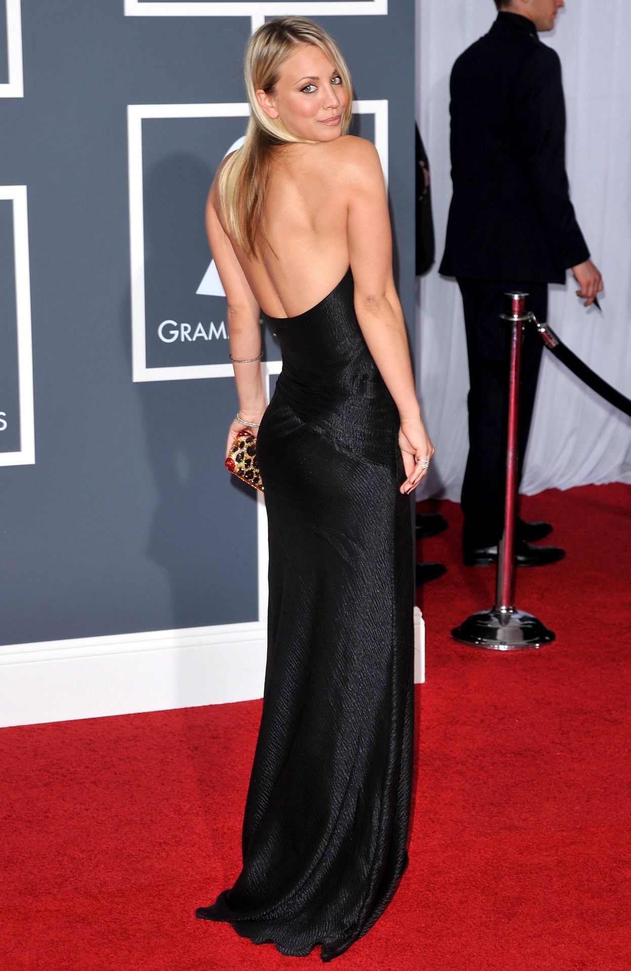
Kate Hudson out in Light Spring shades, proof the palette already lives in her wardrobe.
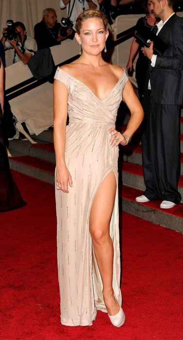
Apricot
#F4B183
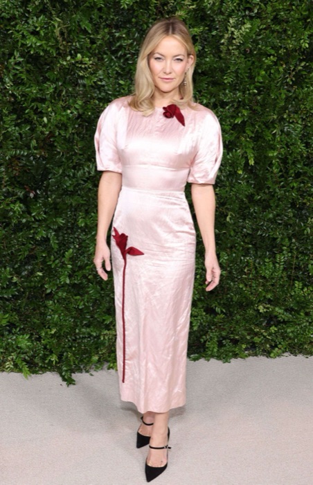
Coral
#F58C7B
Sage Green
#B8CDA0
Powder Blue
#A7C7DE
You've seen Kate in her colors. Now find yours.
A free 15-pick quiz names your season and the shades that fight it. No photo needed.
The 12-season map
Where Kate sits.
Kate Hudson's bubble sits in the Spring quadrant, the family of colors that wear her best. The closer a color sits to her, the better it reads on her face.
What this means.
Stay in Spring
Anything in the Spring quadrant is on-team for Kate, even outside her sub-type.
Borrow neighbours
Light Summer and Warm Spring sit either side. Their picks cross over safely.
Skip the opposite
Light Spring sits opposite. Those shades drain Kate's face.
The read · Undertone
Fair skin with a warm golden-peach cast, warm hazel eyes, and naturally golden-blonde hair. The contrast is low and the coloring is light and clear. Warm, light tints flatter her; hard black and cool, dark shades overwhelm her delicate warmth.
Wear it well
- Wear cream sand near the face
- Wear apricot sorbet near the face
- Wear coral blush near the face
- Wear soft buttercup near the face
- Wear spring mint near the face
Skip on the rack
Colors Kate should skip.
These desaturate or age a Light Spring face.
Pure Black
#000000
Drains the warmth right out of you
Optic White
#FFFFFF
Too stark against your soft contrast
Burgundy
#5A0F2F
Too heavy and cool, ages your face
Charcoal Navy
#2B3E4C
Overpowers your delicate brightness
Makeup map
How Kate wears it.
Six product categories, five named picks each. Take these hexes to the counter, anything within a few shades wears like it was made for her.
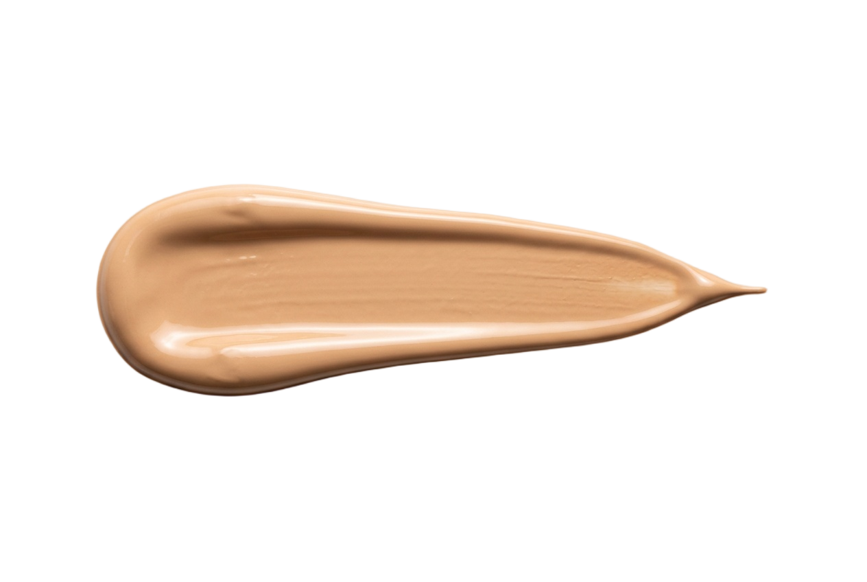
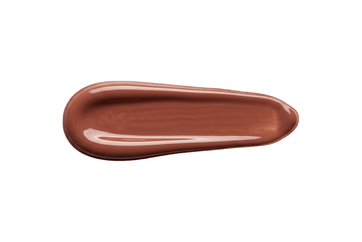
Foundation
Light, warm-neutral undertones with a peachy cast. Skip pink or deep bases, they overwhelm her delicacy.
Warm Porcelain
#F0DAC4
Peach Ivory
#EBCFB2
Light Beige
#E2C09E
Soft Sand
#D6B38E
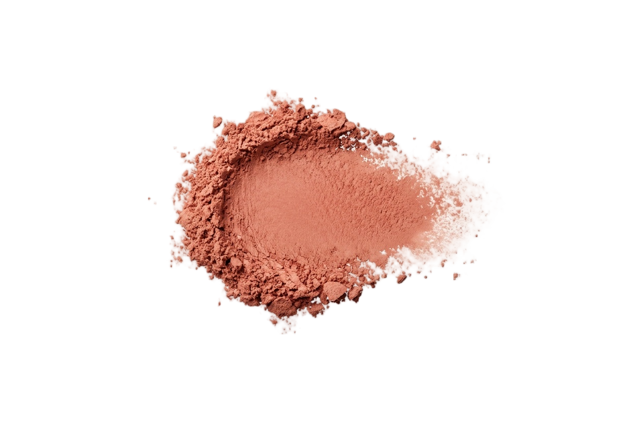
Blush
Warm peach, coral, and light apricot. Cool berry and plum grey out her fresh warmth.
Peach Blossom
#F0B49A
Soft Coral
#F0A488
Warm Pink
#EFAEA6
Apricot
#F2B588
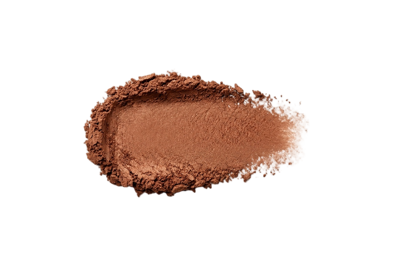
Eyeshadow
Peach, light gold, warm taupe, and soft green. Avoid heavy charcoal and icy silver.
Champagne
#EDD9BE
Light Gold
#DDBD82
Warm Taupe
#B89A7C
Soft Peach
#E5B79A
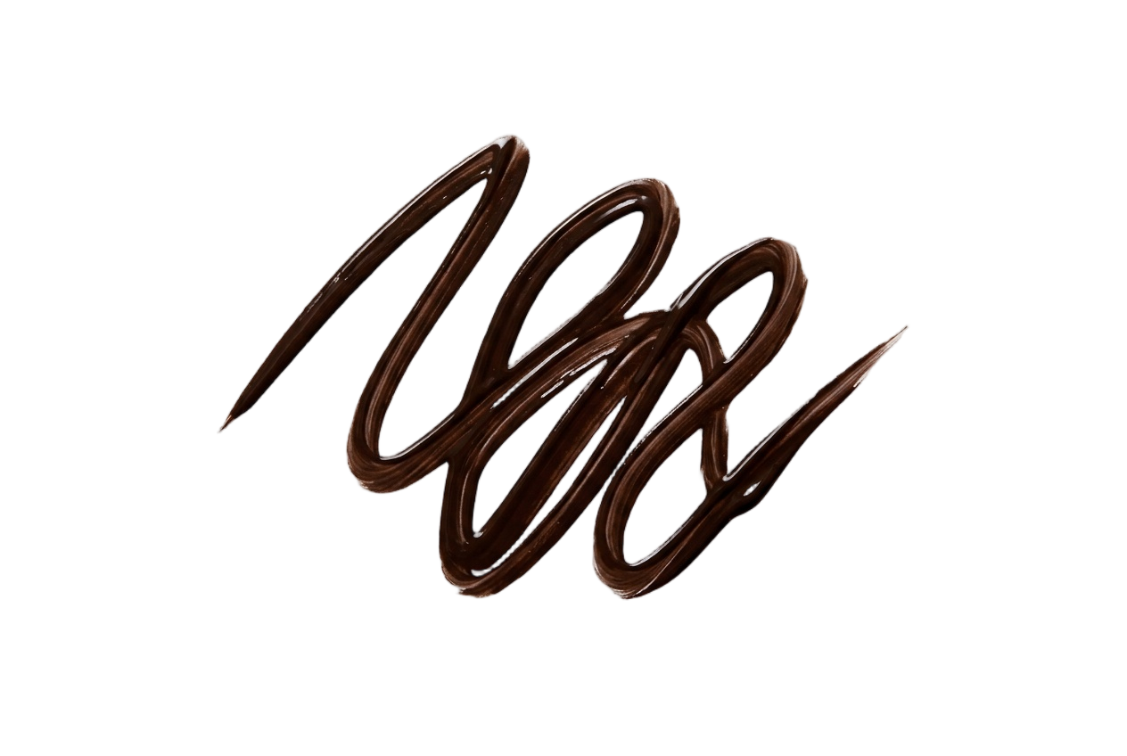
Eyeliner
Warm brown, bronze, and soft olive. Jet black overpowers her light, delicate features.
Warm Brown
#6E5238
Bronze
#8A5E36
Soft Olive
#6E6440
Chestnut
#5A4030
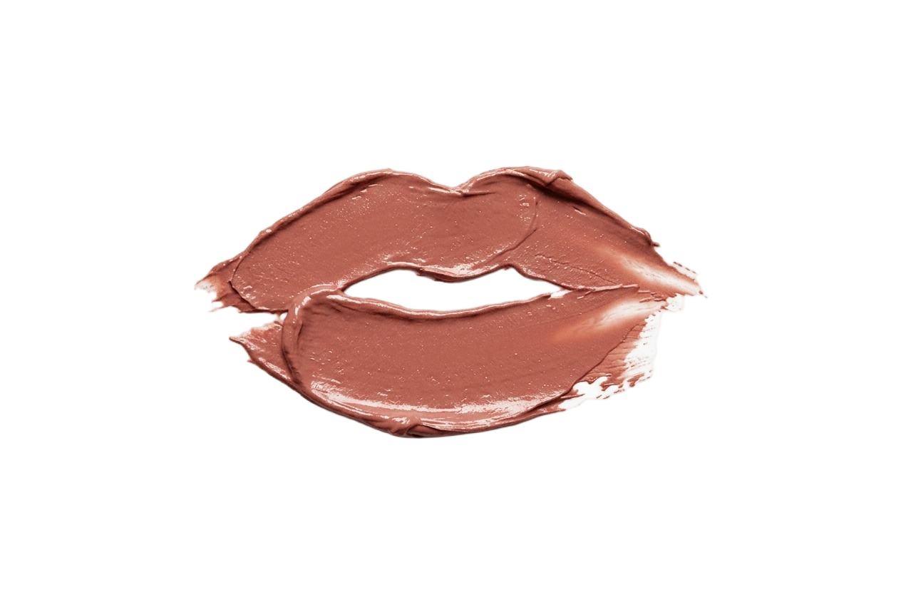
Lip Colors
Peachy pink, coral, and warm nude. Skip deep wines and cool blue-reds.
Peach Nude
#E5A488
Warm Coral
#EC8A70
Petal Pink
#EDA0A0
Soft Salmon
#E8917E
Nail Polish
Sheer peach, coral, and soft warm pink. Skip deep vamps and icy blue-toned pastels.
Sheer Peach
#F2C4A8
Soft Coral
#F0A488
Warm Pink
#EFAEA6
Light Apricot
#F2B588
Your face has a palette like this one.
Find out which of the twelve is yours — free, fifteen picks, nothing to upload.
More Light Springs
Same season, same palette.
Other celebrities who share Kate Hudson's Light Spring coloring, plus the full season guide.
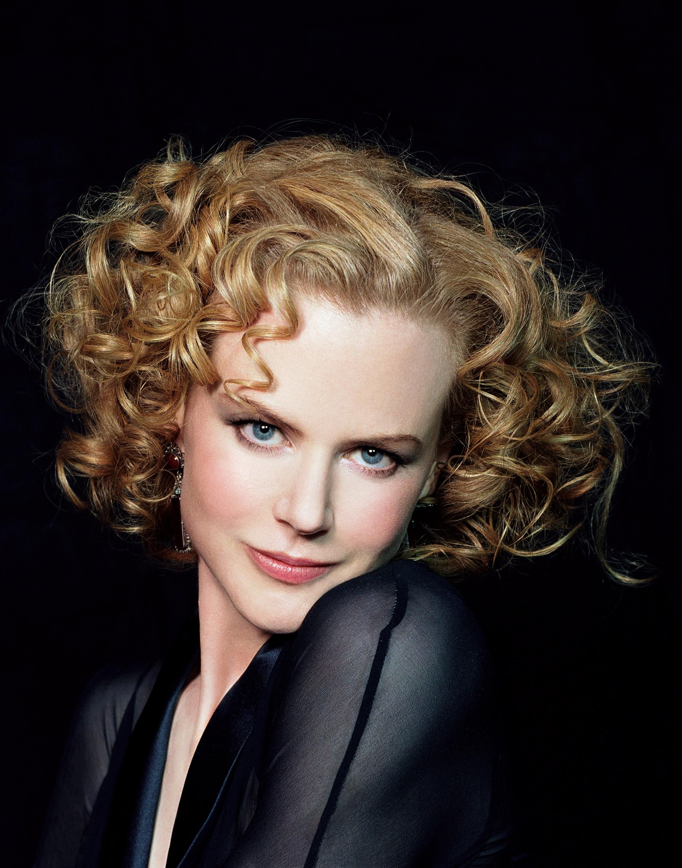

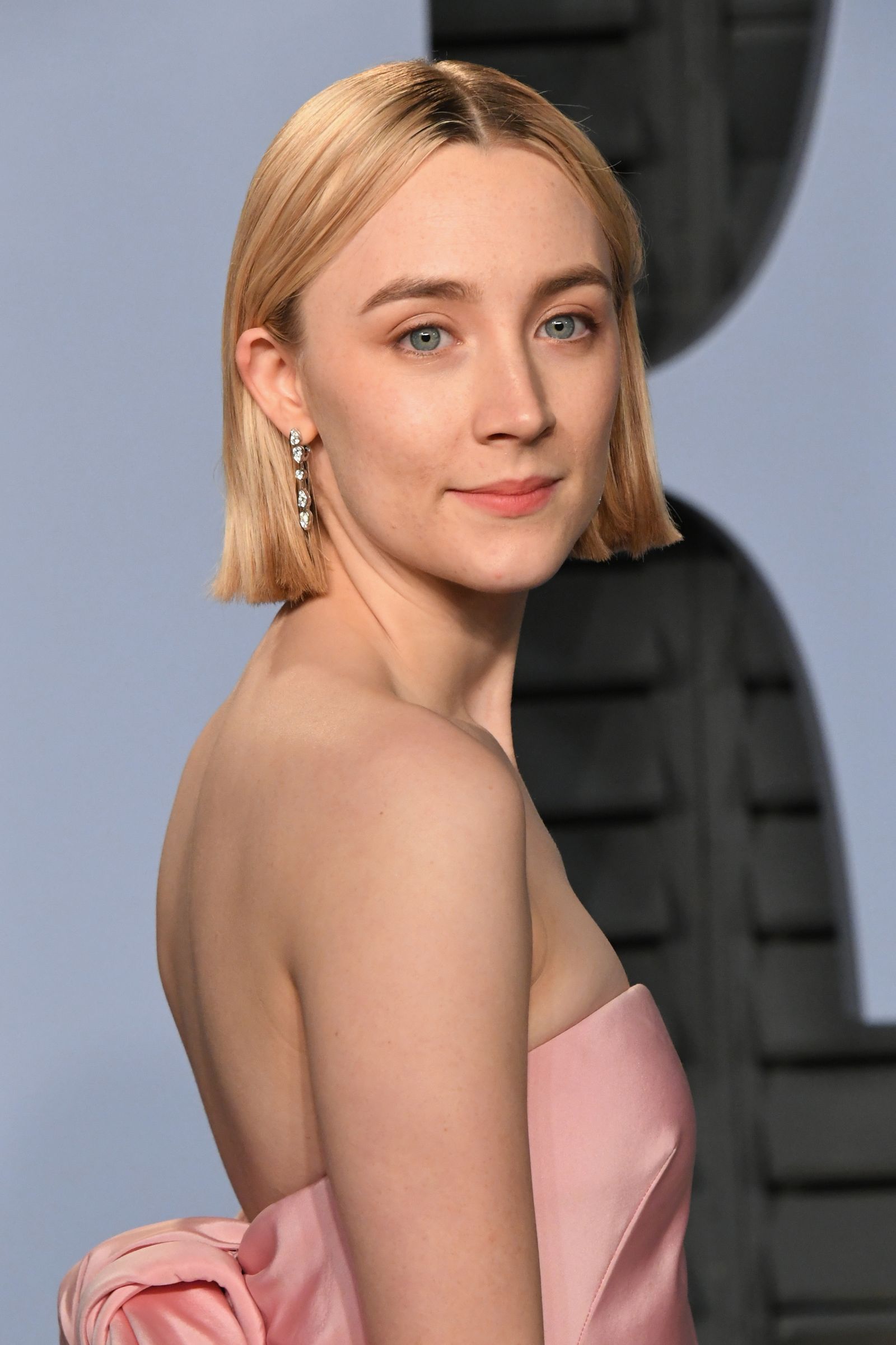
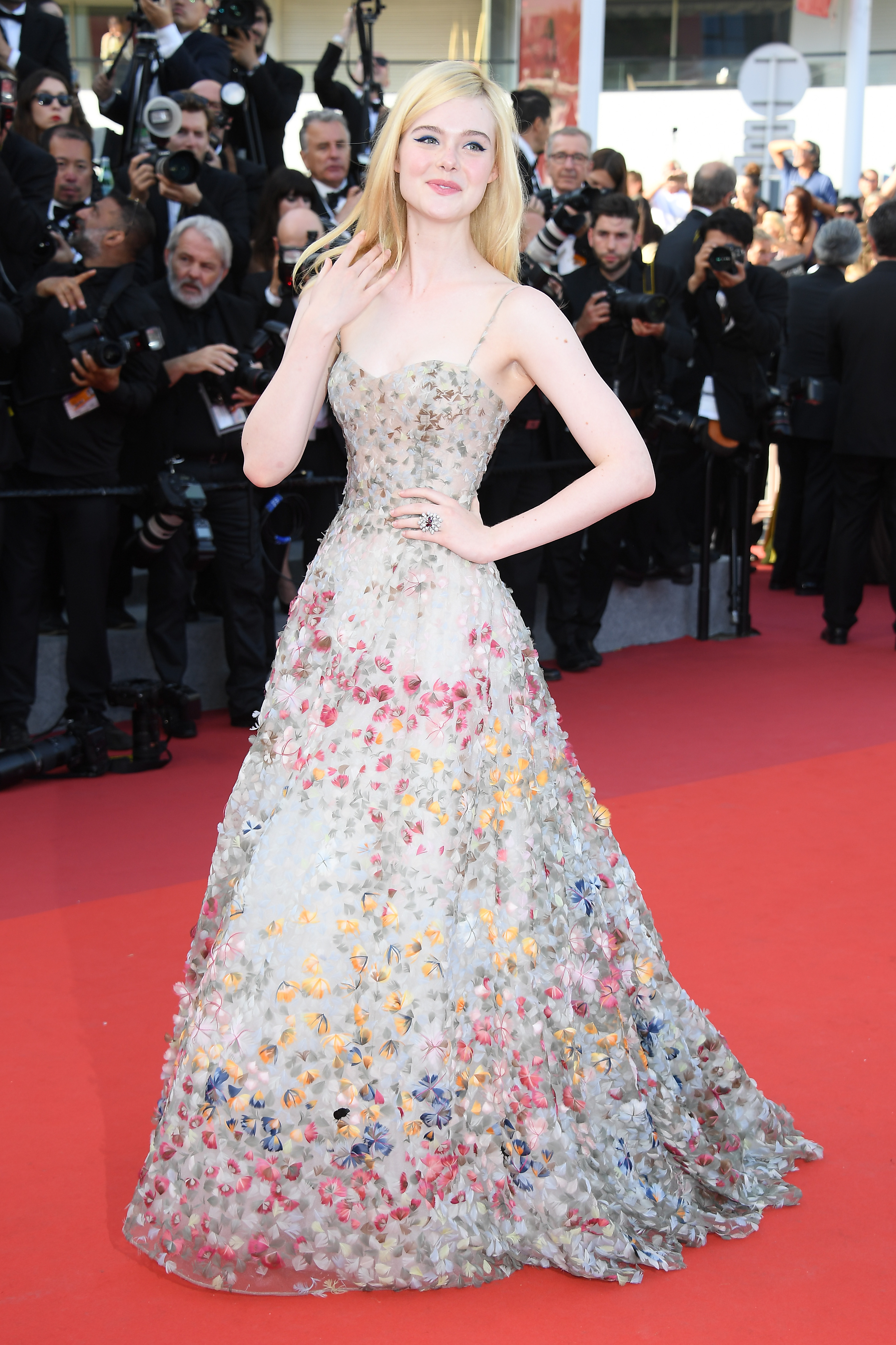
Kate Hudson · color questions
Kate's color questions.
What color season is Kate Hudson?+
Kate Hudson is a Light Spring, light, warm, and clear. Her fair skin with a golden glow, warm hazel eyes, and sunny blonde hair match warm tints like apricot, coral, sage green, and powder blue.
What are Kate Hudson's best colors to wear?+
Light and warm: apricot, coral, peach, sage green, powder blue, light aqua, and golden yellow, with warm ivory and light camel neutrals. They share her warmth and lightness, so they make her skin glow instead of washing it out.
Is Kate Hudson a Light Spring or a Warm Spring?+
Light Spring. Both are warm, but she runs lighter and softer than a Warm Spring. The most saturated warm brights sit heavy on her, while light, clear warm tints like apricot and coral keep her face fresh and lit.
What colors should Kate Hudson avoid?+
Stark, cool, and heavy shades: black, optic white, burgundy, and navy. They're too dark or too cool for her light, warm coloring and drain her skin. She wears warm ivory over black and gold over silver.
What lipstick suits Kate Hudson's coloring?+
Coral, warm peach, and soft warm rose. Deep wine, cool fuchsia, and brown-nude overwhelm a Light Spring, she leans into clear, warm pinks that match her delicate glow.
Which season are you?
Kate Hudson is a Light Spring. Fifteen picks and you'll know yours — free, no photo.
Share
Kate Hudson's palette card