
 Deep Autumn
Color analysis
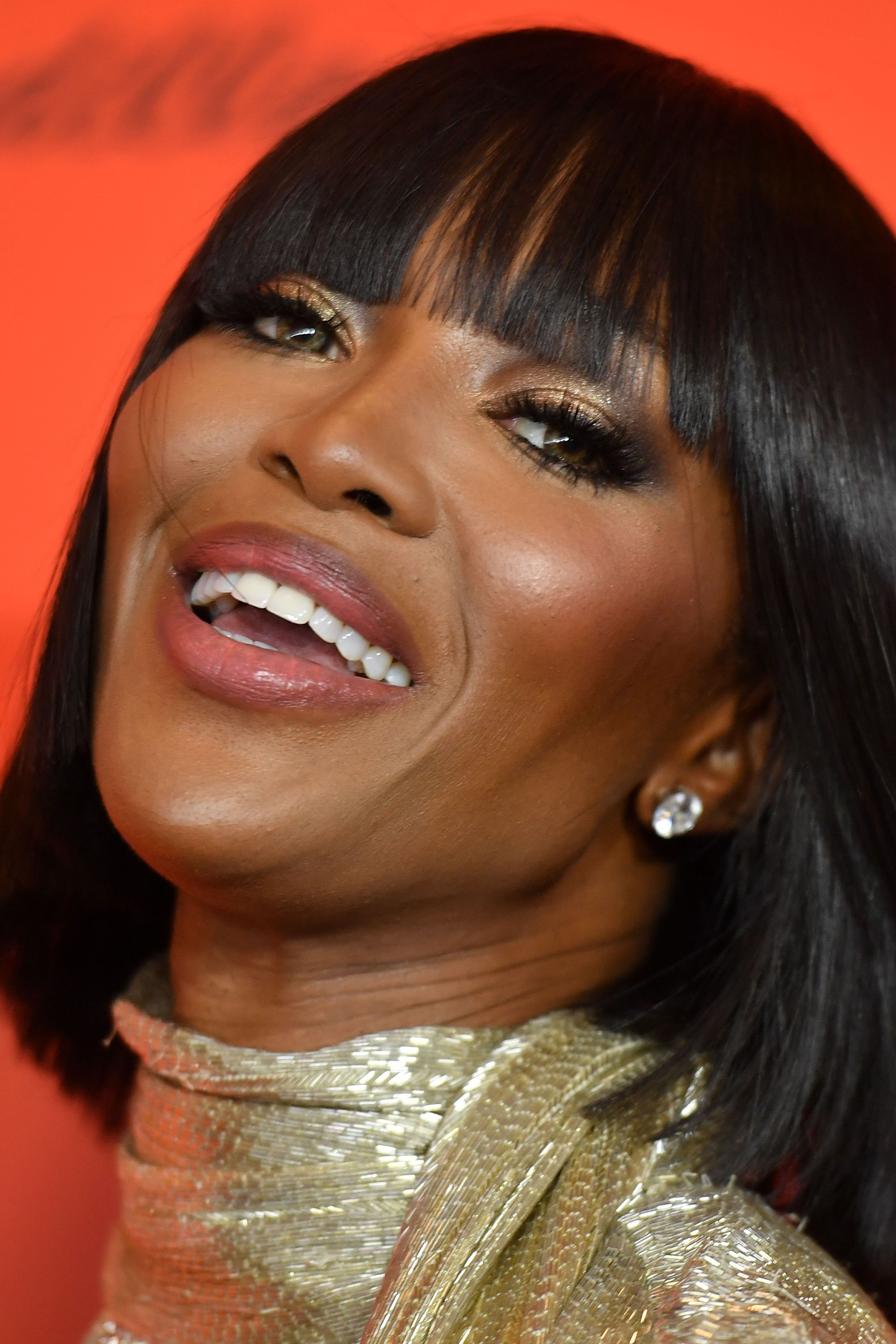
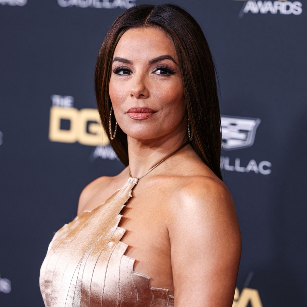
Naomi Campbellis a Deep Autumn.
- Undertone
- Warm
- Contrast
- High
- Chroma
- Medium-high
Naomi Campbell is a Deep Autumn. Her coloring is warm, deep, and richly saturated — which is why molten earth and jewel tones like copper, garnet, and mahogany set her skin alight, while cool or icy shades sit flat against it.
Like sun-warmed amber, ink on parchment, and polished bronze.
Her main colors
6 of 12
Copper
#B56A3A
Garnet
#8D1A1D
Moss
#3D4A23
Espresso
#5A3622
Pumpkin
#A85220
Mahogany
#6B2D1A
About Naomi Campbell's colors
Why Naomi is a Deep Autumn.
Everything about Naomi reads Deep Autumn: high contrast, medium-high chroma, and an unmistakably warm base. Spiced earth tones do the heavy lifting — copper, burnt orange, and pumpkin echo her warmth, while garnet, wine, and mahogany match her depth. Deep teal and moss add richness without going cool, and antique gold or warm ivory ground the palette. These names aren't decoration; they're the exact wavelengths that make her face glow.
She isn't a Deep Winter — those icy, blue-based jewels and stark optic white would clash with her golden warmth rather than flatter it. Nor is she a Warm Autumn, whose lighter, softer earth tones would wash out under her high contrast and deeper saturation; she needs the weight of a true deep palette.
Signature palette
Best colors for Naomi.
The twelve shades that harmonize with Naomi Campbell's deep autumn undertone, contrast, and depth.
Copper
#B56A3A
Garnet
#8D1A1D
Moss
#3D4A23
Espresso
#5A3622
Pumpkin
#A85220
Mahogany
#6B2D1A
Antique Gold
#C7A04A
Deep Teal
#2E4A4A
Wine
#7A2D2A
Burnt Orange
#C46322
Soft Black-Brown
#1F1815
Warm Ivory
#F4DCB0
The 12-season map
Where Naomi sits.
Naomi Campbell's bubble sits in the Autumn quadrant — the family of colors that wear her best. The closer a color sits to her, the better it reads on her face.
What this means.
Stay in Autumn
Anything in the Autumn quadrant is on-team for Naomi, even outside her sub-type.
Borrow neighbours
Deep Winter and Warm Autumn sit either side. Their picks cross over safely.
Skip the opposite
Deep Autumn sits opposite. Those shades drain Naomi's face.
The read · Undertone
Her skin carries a warm golden-bronze undertone, paired with dark warm-brown eyes and deep black-brown hair. Warm metals — yellow gold, brass, and copper — melt into her complexion, while silver and icy platinum read cold and disconnected against her warmth.
Wear it well
- Wear copper near the face
- Wear garnet near the face
- Wear moss near the face
- Wear espresso near the face
- Wear pumpkin near the face
Skip on the rack
Colors Naomi should skip.
These desaturate or age a Deep Autumn face.
- Avoid
Optic White
#FFFFFF
Drains your richness — use ivory
- Avoid
Pastel Pink
#FFC0CB
Too light and cool
- Avoid
Baby Blue
#A8C8D8
Cool pastel fights your depth
- Avoid
Pure Grey
#888888
Too neutral and dull
Makeup map
How Naomi wears it.
Six product categories, five named picks each. Take these hexes to the counter — anything within a few shades wears like it was made for her.
Warm Beige
#D6B391
Honey Sand
#C9A47A
Peachy Buff
#DBB39A
Caramel Beige
#C09775
Toasted Almond
#B89070
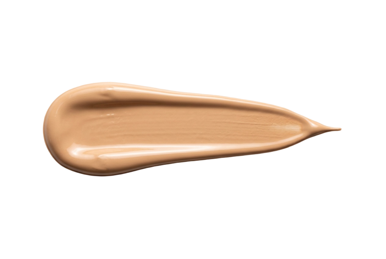
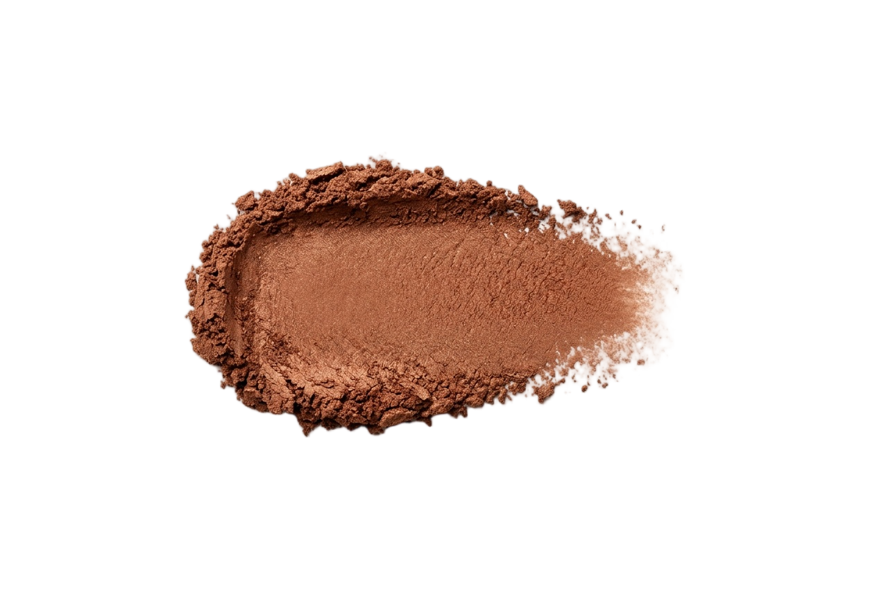
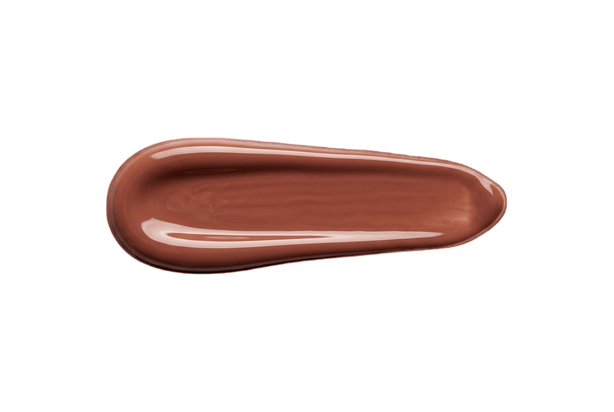
Foundation
Warm, golden, peachy undertones. Skip pink or cool olive bases — they read tired on her.
Apricot
#DCAC8B
Peach
#E0A07F
Warm Rose
#C68C7E
Terracotta
#C28A55
Dusty Rose
#B87B7B
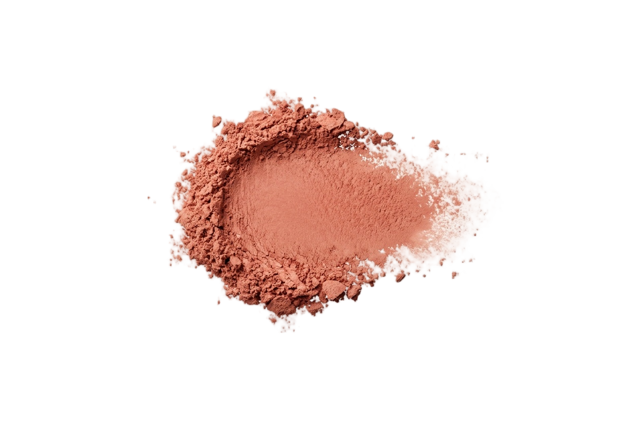
Blush
Peach, apricot, warm rose, and terracotta. Cool berry tones fight her warmth.
Bone
#E8DCC8
Camel
#A78B6A
Bronze
#B6803D
Olive
#6E5C3B
Espresso
#3D2817
Eyeshadow
Gold, copper, bronze, olive, and warm brown. Avoid icy silvers and cool jewel tones.
Espresso
#3D2817
Walnut
#5C4838
Olive
#5E5A36
Bronze
#7A5530
Soft Black
#1A1410
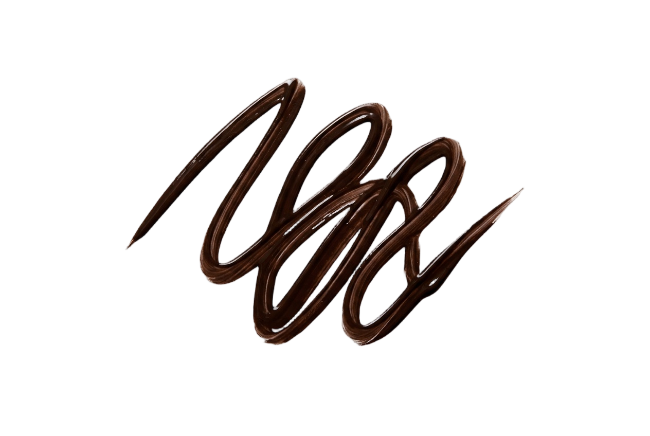
Eyeliner
Brown, olive, and bronze. Pitch black reads harsh — her lash line wants softer depth.
Peachy Nude
#C9947B
Caramel Nude
#A6745F
Dusty Rose
#B87B7B
Brick
#A85A48
Mulled Wine
#7B4838
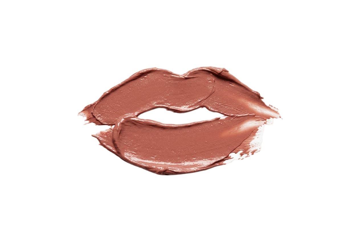
Lip Colors
Caramel nude, dusty rose, brick, and mulled wine. Skip cool fuchsias and bright blue-reds.
Toasted Almond
#C9A689
Caramel
#A07F58
Deep Mauve
#8B6065
Espresso
#5C4032
Wine
#7B2D26
Nail Polish
Warm caramels, almonds, and wines. Skip frosty pinks and icy blue-toned pastels.
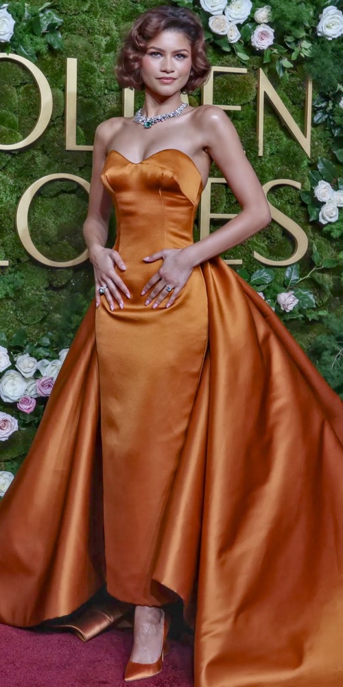
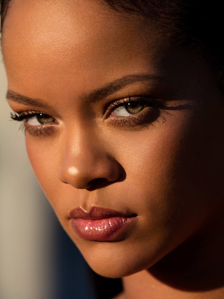
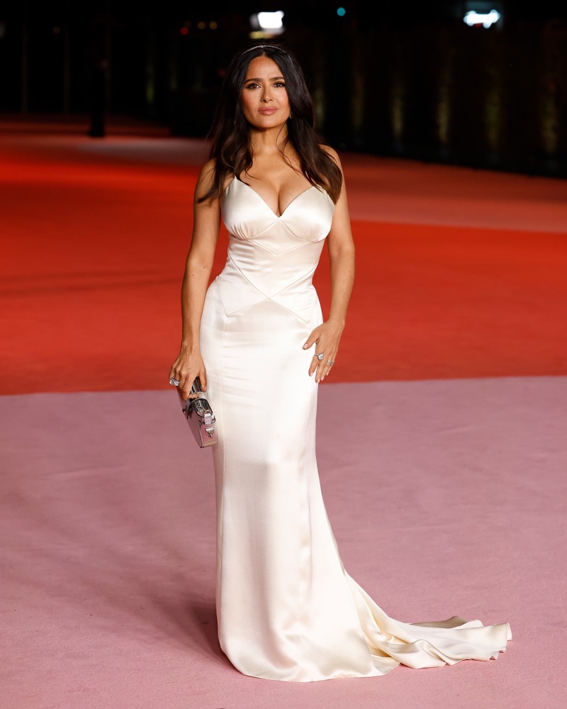
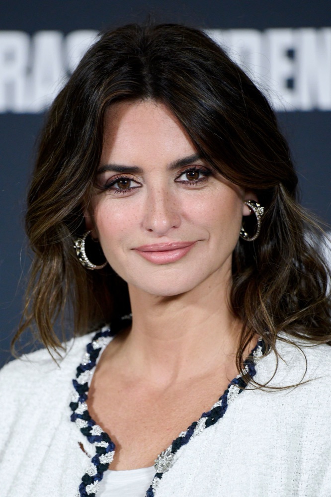
More Deep Autumns
Same season, same palette.
Other celebrities who share Naomi Campbell's Deep Autumn coloring — plus the full season guide.
Naomi Campbell · color questions
Naomi's color questions.
What color season is Naomi Campbell?+
Naomi Campbell is a Deep Autumn — warm-undertoned, high-contrast, and richly saturated. Her golden-bronze skin, dark warm-brown eyes, and deep black-brown hair call for spiced earth and jewel tones rather than the cool, icy shades of a Winter palette.
What are Naomi Campbell's best colors to wear?+
She glows in copper, garnet, burnt orange, pumpkin, and mahogany, with deep teal, moss, and wine adding jewel-toned richness. For neutrals, reach for espresso, soft black-brown, antique gold, and warm ivory — all warm and deep enough to hold their own against her contrast.
Is Naomi Campbell a Deep Autumn or a Deep Winter?+
Deep Autumn. Both seasons share depth and high contrast, but Naomi's undertone is unmistakably warm and golden. Deep Winter's cool, blue-based jewels and icy whites would fight her warmth, while warm copper, mahogany, and antique gold harmonize with it.
What colors should Naomi Campbell avoid?+
Optic white drains her richness — swap it for warm ivory. Pastel pink and baby blue are too light and cool, pure grey reads dull and neutral, and silver fights her warmth. Trade silver for yellow gold, copper, or brass.
What lipstick suits Naomi Campbell's coloring?+
Warm, deep, and spiced shades flatter her most: brick, wine, warm berry, and terracotta. These echo her golden undertone and high contrast, while cool blue-pinks and frosted nudes look chalky and disconnected against her bronze warmth.
Your turn
Which season are you?
The same analysis that typed Naomi Campbell as a Deep Autumn — run on your selfie in about 15 minutes.
Find my colors