
Contents+
Colors wash you out when they mismatch your coloring on temperature, depth, or chroma, bouncing the wrong kind of light onto your face so your skin reads grey, sallow, or tired. No color does this to everyone. The optic white that kills a Soft Autumn is a Deep Winter's best neutral.
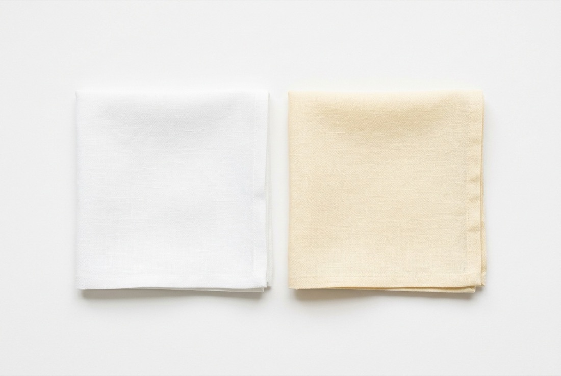
Washing out is physics, not bad luck
Every shirt you wear is a reflector aimed at your jaw. Wear a color that matches your skin's temperature and depth and it bounces flattering light upward, evening you out. Wear a mismatch and it bounces the wrong temperature onto you, and your face does the apologizing: grey cast, sunken eyes, foundation that suddenly looks like it's sitting on top of your skin.
So the question is never whether a color is bad. It's bad for whom. Mismatches come in three flavors: wrong temperature (a cool color on warm skin, or the reverse), wrong depth (a pale color swallowing deep coloring, a heavy one crushing light coloring), and wrong chroma (a neon screaming over a soft, blended face). Each of the ten below fails on at least one dial, and each swap fixes exactly that dial.
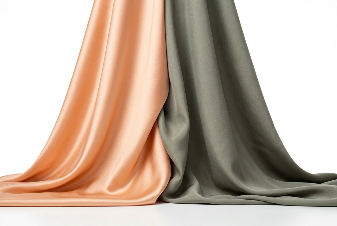
The ten usual suspects, and their swaps
These ten come up constantly because each one sits at an extreme of temperature, depth, or chroma, which means each one is a miracle on the coloring it matches and a disaster on the coloring it doesn't. The table maps who gets drained and where to run instead.
| Color | Who it drains | Swap |
|---|---|---|
| Optic white | Warm and soft seasons | Cream or warm ivory |
| Pure black | Light and soft seasons | Espresso or charcoal |
| Pastel pink | Deep and warm seasons | Dusty peach or soft brick |
| Baby blue | Deep and warm seasons | Deep teal or sapphire |
| Beige / greige | Bright and deep seasons | Soft camel (warm) or dove grey (cool) |
| Neon anything | Every soft season | The saturated-but-deep version of the hue |
| Hot pink | Soft and muted seasons | Muted mauve or warm rose |
| Mustard | Cool seasons | Antique gold (warm) or none (cool) |
| Pure grey | Warm seasons | Warm taupe or mocha |
| Burgundy | Light seasons | Rose quartz or soft brick |
White and black, the two everyone gets wrong
Optic white is blue-white. On a cool, high-contrast Deep Winter it's crisp and expensive-looking. On anyone warm or soft it throws icy light up at the jaw, and warm skin answers with sallow yellow. The fix costs nothing: cream for warm seasons, and the shirt still reads as white to everyone but your face.
Pure black pulls the opposite trick. It reflects almost nothing, so it carves shadows under the chin and eyes of anyone without serious natural contrast. A Light Summer in black looks like a passport photo taken at a funeral. Espresso does black's slimming, serious job for warm seasons; charcoal does it for cool ones. Deep Winters can ignore this paragraph entirely and keep their jet black.
Pastels, neons, and the muddy middle
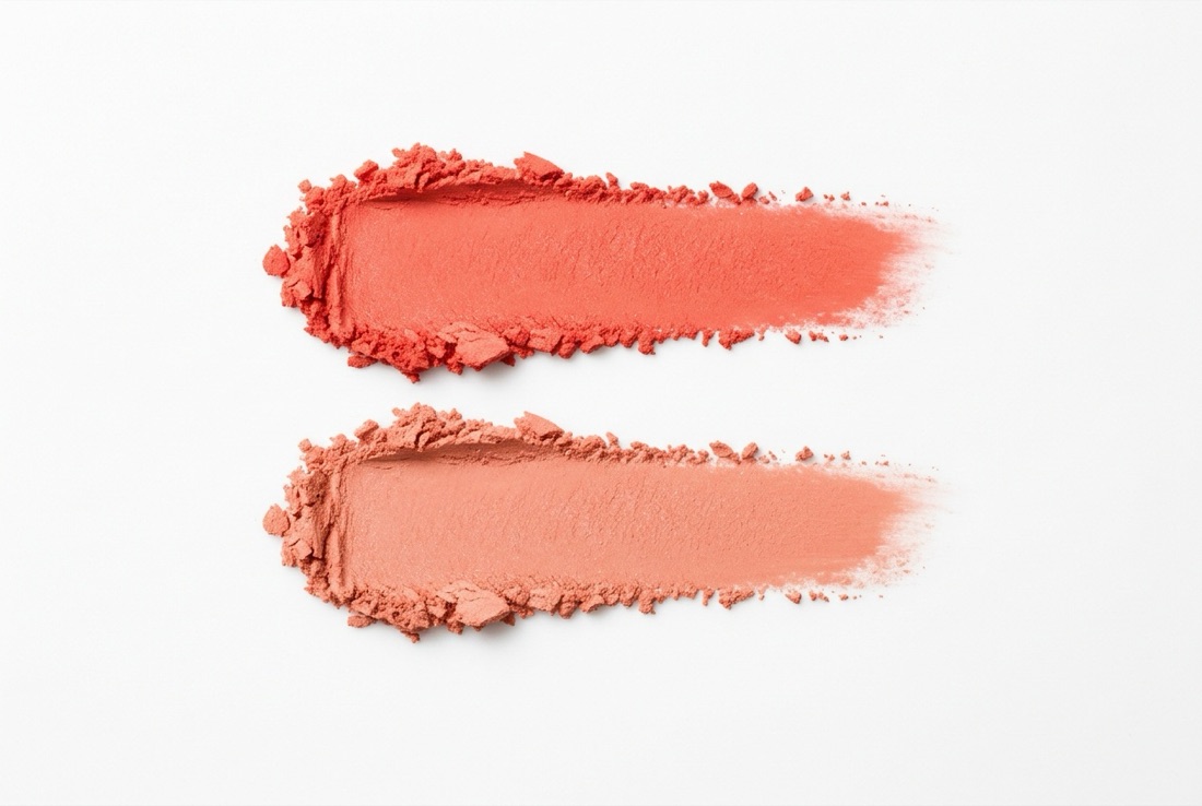
Pastel pink and baby blue fail on depth: hold that little pigment next to deep or warm-olive coloring and the face overpowers the fabric, which reads, weirdly, as the face looking tired. Deep seasons should take the same hues down and up: soft brick instead of pastel pink, sapphire instead of baby blue.
Neon and hot pink fail on chroma. A Clear Spring can ride a neon; a Soft Summer next to one looks like the 'before' photo, because the fabric out-shouts every blended tone in her face. The swap is the muted cousin: muted mauve, warm rose, dusty anything.
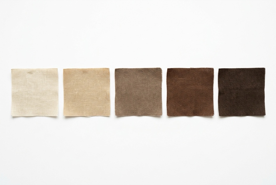
Beige and greige fail by refusing to commit. They're close enough to skin to blur into it, so bright and deep colorings lose all their edges. If you want quiet, pick a quiet color with an actual opinion: soft camel if you're warm, dove grey if you're cool.
Mustard and pure grey are the temperature extremists. Mustard's heavy yellow turns cool skin sallow on contact; antique gold carries the same mood for warm seasons, and cool seasons should just walk past. Grey does the reverse, casting cool, colorless light that turns warm faces ashen. And burgundy, glorious on a Deep Winter, is simply too much pigment for a Light Spring or Light Summer, wearing them instead of the other way around.
How to find your own list
The ten above are the common offenders, but your personal wash-out list depends on where you sit on the three dials. Get your temperature, depth, and chroma read once and both lists, the drains and the swaps, fall out automatically. The free quiz at /what-is-my-color-season sorts you into a season in a couple of minutes, and the season page hands you the full palette plus the specific shades to keep away from your face.
Quick answers
Common questions.
Why do some colors wash me out?+
Because they mismatch your coloring on temperature, depth, or chroma. The fabric bounces the wrong kind of light onto your face, so your skin picks up a grey or sallow cast, shadows deepen, and features blur. The same color flatters someone whose coloring it matches.
What colors wash out pale skin?+
Usually colors that out-muscle it: pure black, burgundy, and anything neon overwhelm light coloring, while beige and greige blur into it. Pale skin generally does better in light-to-medium shades with clear temperature, like powder blue and rose quartz for cool types or cream and dusty peach for warm ones.
How do I know which colors wash ME out?+
Find your position on the three dials: warm or cool, light or deep, soft or bright. The free season quiz at /what-is-my-color-season does this in a few minutes and returns your full palette plus the specific colors to avoid, which beats testing shades one at a time.
Eujin Choi
Professional draper, Seoul
Eujin runs her own personal-color clinic in Seoul, where seasonal analysis began. She has draped thousands of clients in person, and that hands-on read of how real fabric falls on real skin is what shapes everything she writes here.
Further reading