Catherine Zeta-Jones
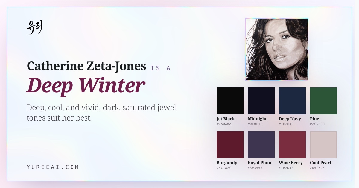
is a Deep Winter.
- Undertone
- Cool-neutral
- Contrast
- High
- Chroma
- High
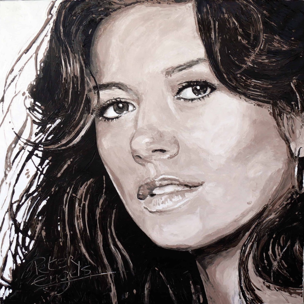
Catherine Zeta-Jones is a Deep Winter. Her cool porcelain skin, near-black hair, and dark brown eyes give her the deep, cool, high-contrast look of the season, so sapphire, emerald, magenta, and cherry red read as vivid on her, while pumpkin orange, warm beige, and camel wash her out.
Her main colors
Jet Black
#0A0A0A
Midnight
#0F0F1E
Deep Navy
#1B2840
Pine
#2C5538
Burgundy
#5C1A2C
Royal Plum
#3E3550
Like river stone, ink on parchment, and sun-ripe cherry.
This page is Catherine's season. What's yours?
Fifteen quick picks — no photo, no email. You'll have your season by the end of this page.
Her coloring
Catherine's undertone, skin tone & eye color.
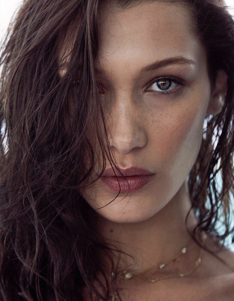
The features that place Catherine Zeta-Jones in Deep Winter: undertone, skin tone, eye color, hair, and natural contrast.
- Undertone
- Cool
- Skin tone
- Cool porcelain
- Eye color
- Dark brown
- Hair
- Near-black
- Contrast
- High
About Catherine Zeta-Jones's colors
Why Catherine is a Deep Winter.
Catherine is a Deep Winter: depth plus coolness plus dramatic contrast. Jewel tones, sapphire, emerald, magenta, cherry red, and true black, mirror her porcelain-and-jet colouring and keep her looking crisp and luminous.
She is not an Autumn, pumpkin orange, warm beige, and camel are warm and muted, and they dull her cool porcelain and soften her contrast. And she is not a Summer: dusty, greyed pastels look flat on her, the tell that her season is a deep, clear Winter, not a soft cool one.
Full Deep Winterseason guide: traits, styling & celebrities →
Often confused with Deep Winter vs Deep Autumn and Deep Winter vs Cool Winter.
Signature palette
Best colors for Catherine.
The twelve shades that harmonize with Catherine Zeta-Jones's deep winter undertone, contrast, and depth.
Jet Black
#0A0A0A
Midnight
#0F0F1E
Deep Navy
#1B2840
Pine
#2C5538
Burgundy
#5C1A2C
Royal Plum
#3E3550
Wine Berry
#7B2D40
Cool Pearl
#D5C5C5
Pure White
#FFFFFF
Sapphire
#1F4060
Magenta
#8A2A4E
Cherry Red
#6E0D2B
Seen in her colors
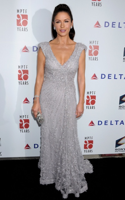
Catherine wears the palette.
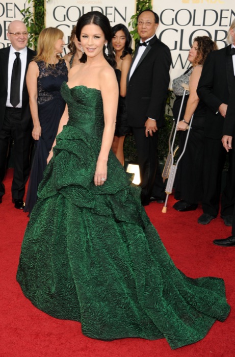
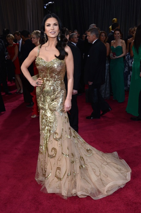
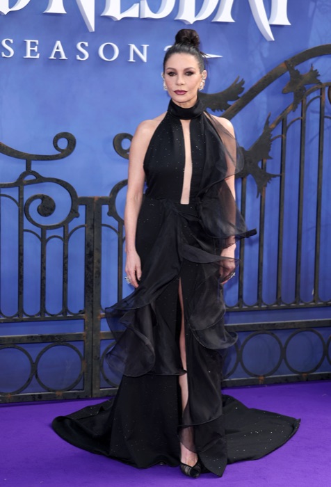
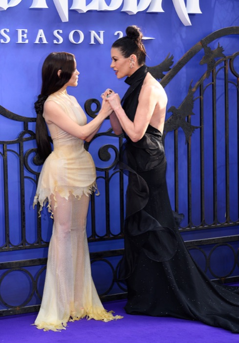
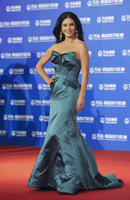
Catherine Zeta-Jones out in Deep Winter shades, proof the palette already lives in her wardrobe.
Sapphire
#0F52BA
Emerald
#046307
Magenta
#C71585
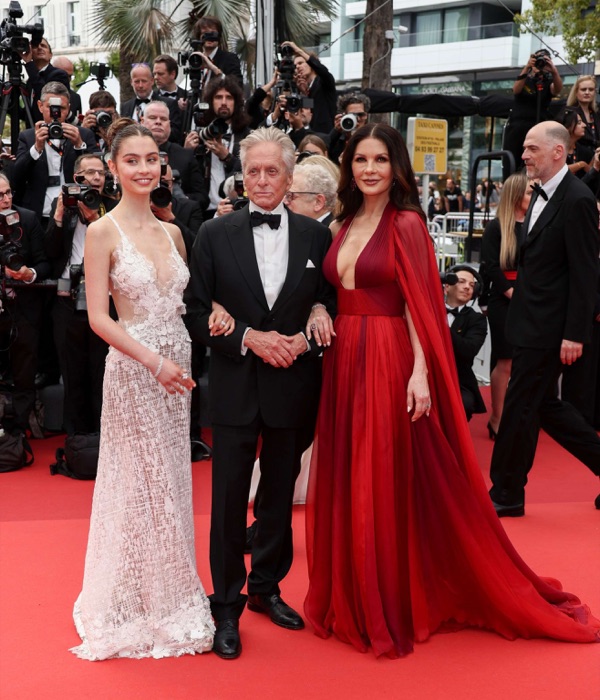
Cherry Red
#B00020
You've seen Catherine in her colors. Now find yours.
A free 15-pick quiz names your season and the shades that fight it. No photo needed.
The 12-season map
Where Catherine sits.
Catherine Zeta-Jones's bubble sits in the Winter quadrant, the family of colors that wear her best. The closer a color sits to her, the better it reads on her face.
What this means.
Stay in Winter
Anything in the Winter quadrant is on-team for Catherine, even outside her sub-type.
Borrow neighbours
Deep Autumn and Cool Winter sit either side. Their picks cross over safely.
Skip the opposite
Deep Winter sits opposite. Those shades drain Catherine's face.
The read · Undertone
Cool porcelain skin, glossy near-black hair, and dark brown eyes, the classic pale-skin-dark-hair combination that creates very high natural contrast. Deep, cool, saturated colour reads as elegant and sharp rather than heavy on her.
Wear it well
- Wear jet black near the face
- Wear midnight near the face
- Wear deep navy near the face
- Wear pine near the face
- Wear burgundy near the face
Skip on the rack
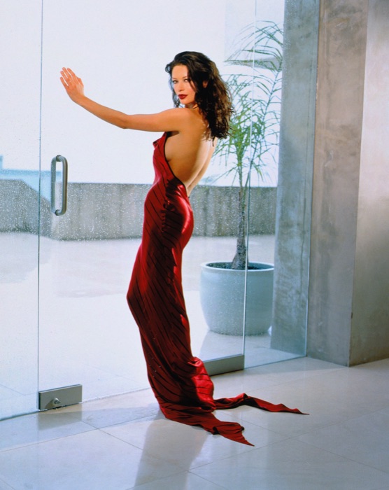
Colors Catherine should skip.
These desaturate or age a Deep Winter face.
Warm Beige
#FFE4B5
Drains the cool clarity
Pumpkin
#FF8C42
Warm and earthy, clashes
Tan
#D2B48C
Too warm and muted
Honey Gold
#C68E4A
Too warm, go cool gold or silver
Makeup map
How Catherine wears it.
Six product categories, five named picks each. Take these hexes to the counter, anything within a few shades wears like it was made for her.
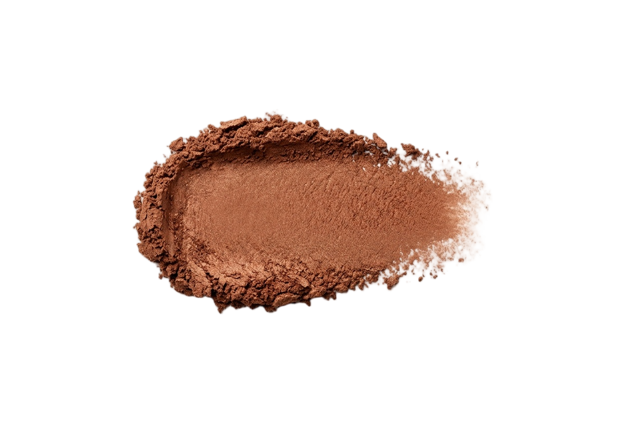
Foundation
Cool to neutral undertones with real depth. Skip golden or peachy bases, they warm and dull her.
Cool Ivory
#E6D0C6
Neutral Beige
#CFB2A2
Cool Sand
#B8947E
Deep Mocha
#8A6252
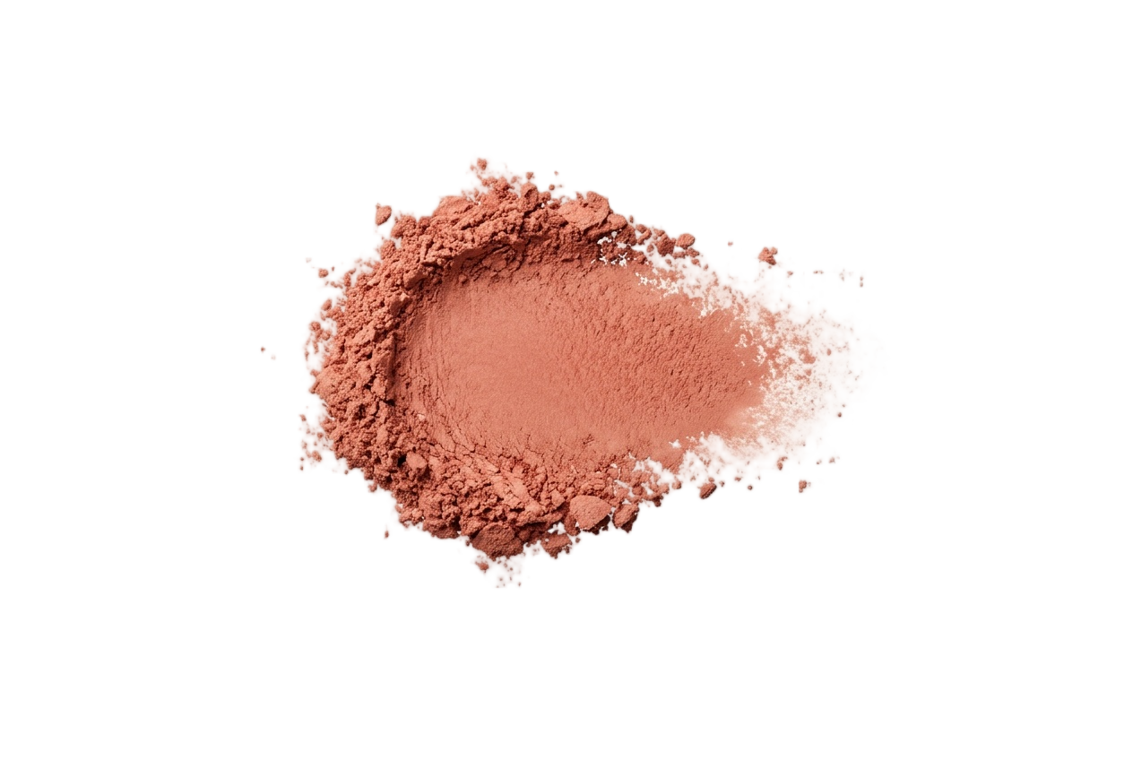
Blush
Cool berry, deep plum, and cool rose. Peach and warm bronze grey her out.
Cool Berry
#B0426A
Deep Plum
#8A3A5E
Cool Rose
#C46E88
Wine Flush
#933050
Eyeshadow
Charcoal, deep plum, cool taupe, and pine. Avoid warm gold, copper, and bronze.
Icy Pearl
#E2E0E6
Cool Taupe
#8A8088
Charcoal
#34343E
Deep Plum
#402A44
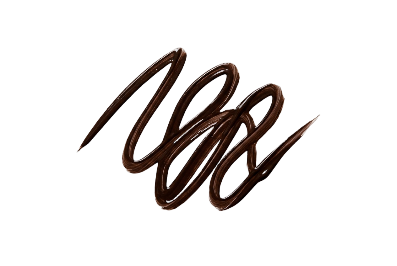
Eyeliner
True black, charcoal, and deep navy. Cool depth at the lash line, never warm brown.
True Black
#0A0A0A
Charcoal
#28282E
Deep Navy
#1A2440
Blackened Plum
#281A28
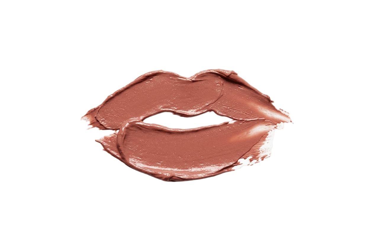
Lip Colors
Deep red, wine, plum, and blackberry. Skip coral, brick, and warm nudes.
Deep Red
#9C1F2E
Wine
#6E1F30
Plum
#5A2444
Blackberry
#3E1E34
Nail Polish
Deep red, wine, plum, and black. Skip coral, peach, and warm browns.
Deep Red
#8E1C2C
Wine
#6E1F30
Plum
#4E2440
Blackberry
#341A2C
Your face has a palette like this one.
Find out which of the twelve is yours — free, fifteen picks, nothing to upload.
More Deep Winters
Same season, same palette.
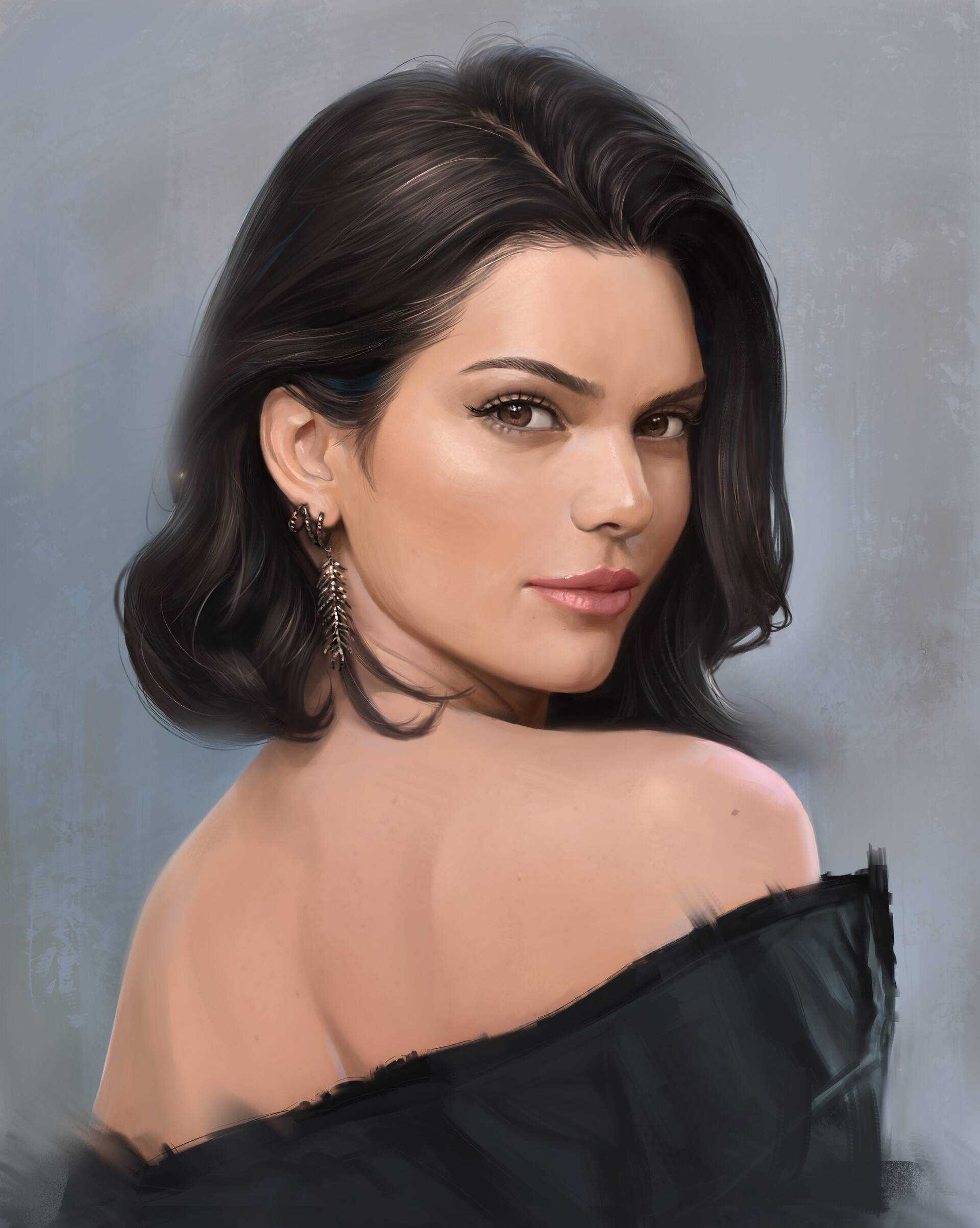
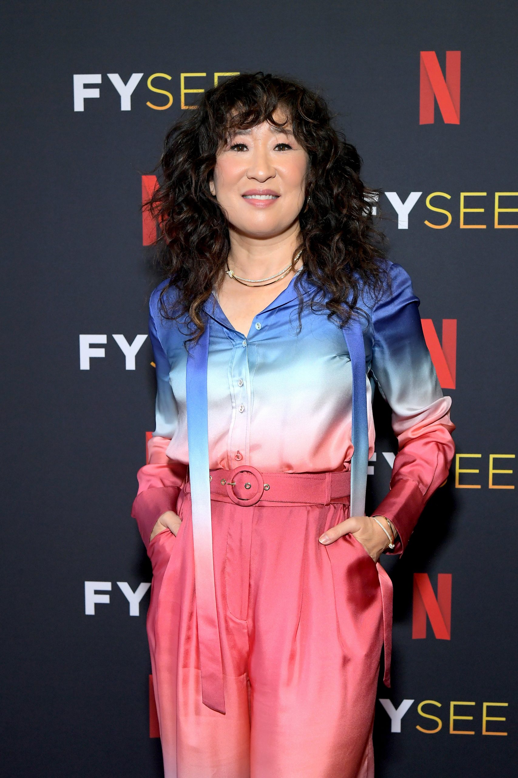
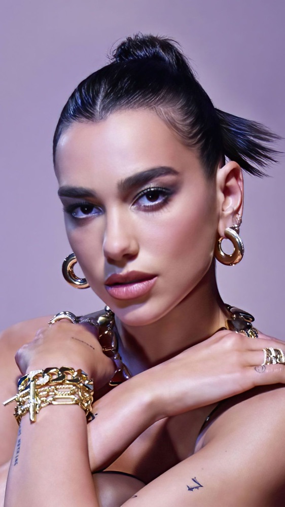
Other celebrities who share Catherine Zeta-Jones's Deep Winter coloring, plus the full season guide.


Catherine Zeta-Jones · color questions
Catherine's color questions.
What color season is Catherine Zeta-Jones?+
Catherine Zeta-Jones is a Deep Winter, the deep, cool, high-contrast corner of the 12-season system. Her porcelain skin, near-black hair, and dark eyes match a palette of sapphire, emerald, magenta, cherry red, and black.
What are Catherine Zeta-Jones's best colors to wear?+
Cool and saturated: sapphire, emerald, magenta, cherry red, and true blue, with pure white and black as neutrals. Deep jewel tones match her contrast and make her features pop.
Is Catherine Zeta-Jones a Deep Winter or a Cool Winter?+
Deep Winter. Both are cool and high-contrast, but her depth pushes her to the darkest, most saturated end, jewel tones over the icy pastels of Cool Winter. Either way she is a cool, high-contrast Winter.
What colors should Catherine Zeta-Jones avoid?+
Pumpkin orange, warm beige, camel, and olive, warm earthy shades that dull her porcelain skin and blur her contrast. Cool white and charcoal work better as neutrals.
What lipstick suits Catherine Zeta-Jones's coloring?+
True red, deep berry, plum, and blue-red, clear, cool, saturated shades that match her high contrast. Skip coral and warm brick; they fight her cool undertone.
Which season are you?
Catherine Zeta-Jones is a Deep Winter. Fifteen picks and you'll know yours — free, no photo.
Share
Catherine Zeta-Jones's palette card